Blanket Case Study
Blanket is an inventory management app centered around creating one place to consolidate your informational, technical, and financial content. The biggest design challenge was creating a customized space for consolidation without overwhelming the user with too many choices.
With a combination of market research and user interviews, I set a base of expectations and user needs. From there, I chose a multi-stage user testing approach to establish practical red routes for the end user.
As the UX Research & Design Lead, I carried out each aspect of research, testing, design, and prototyping.
Problem & Idea
I am a minimalist, and am aware of the items I own and can determine the value they bring to my life. During my research on the subject of personal belongings, I found that the average household has an estimated 300,000 items. Of course, it is possible to reduce that number by not counting every single paper clip, but even half of it is staggering.
Now consider, what percentage of items remain unused? How many of them cause clutter? These questions led to the origin of the problem: How do we organize and properly manage all of our items? Through secondary research, user interviews, affinity maps, sketches, and low-fidelity wireframes, I uncovered a problem inside my solution.
This obstacle required me to return to the drawing board.
My original solution was to have a user document each item they own, then use the app to determine which items to “keep” and which to label as “clutter” and move to donation centers.
The problem inside the solution was that a user does not have the time to create a digital management system of every item they own, even if the app made it simple to document these items. It is just going to take way, way, way too much time.
I reviewed the interviews, personas, empathy maps, and user testing to discover a manageable problem within the information I had gathered. Here is a quote that sparked an idea from an unmoderated wireframe user test:
“I love the ability to add a photo and dictate the item verbally. Also, under item-add, consider optional data items, such as date acquired (to calculate the time of ownership), price (for insurance purposes), photo of receipt, model or serial # (needed for some warranty items), vendor information...”
- Wireframe User Test Participant
Research Findings
To further my understanding of the current field I conducted a competitive analysis and heuristics analysis of three current apps. The heuristics I chose to test were:
- Consistency and Standards
- Recognition Rather than Recall
- Aesthetic and Minimalist Design
I chose these three to rank my competition because these are the main heuristics in which I wanted my own solution to excel. It is important for my platform to be consistent in community standards, easily followed, and simplistically designed for an enjoyable experience. These heuristics lend themselves well when I’m focusing on an organized and simplistic interface with natural navigation, which I did not see in my analysis of other platforms.
After the screener survey of 28 individuals, I completed extensive user interviews with five of the respondents. The user interviews were very important in determining user goals and pain points associated with the problem. I organized their thoughts and some quotes onto an affinity map and then re-organized into themes.
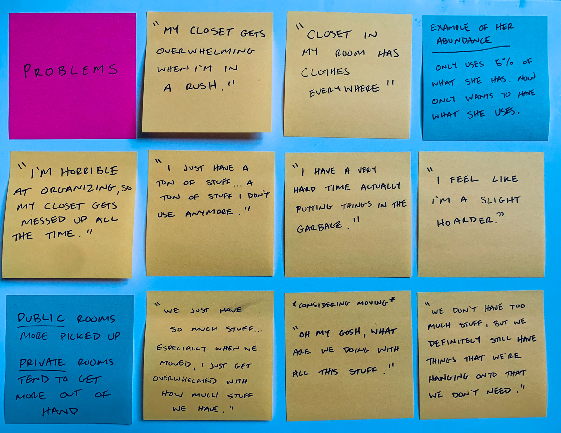
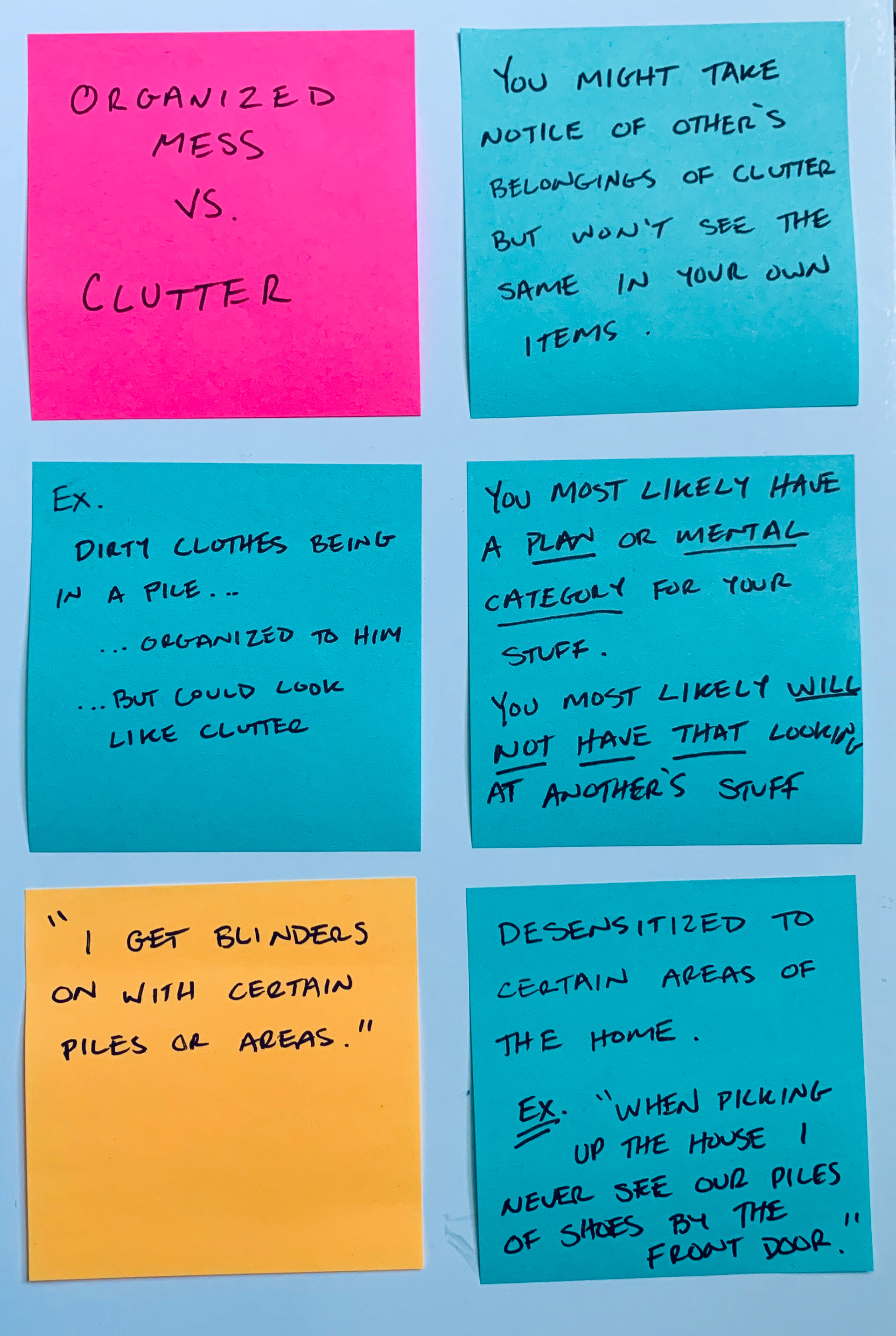
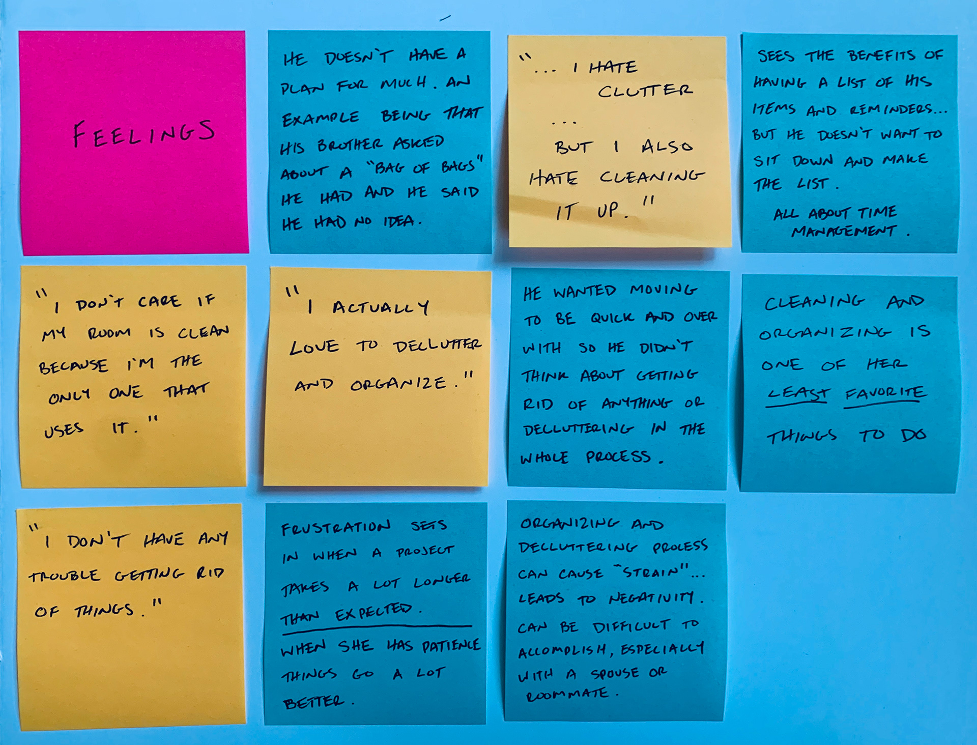
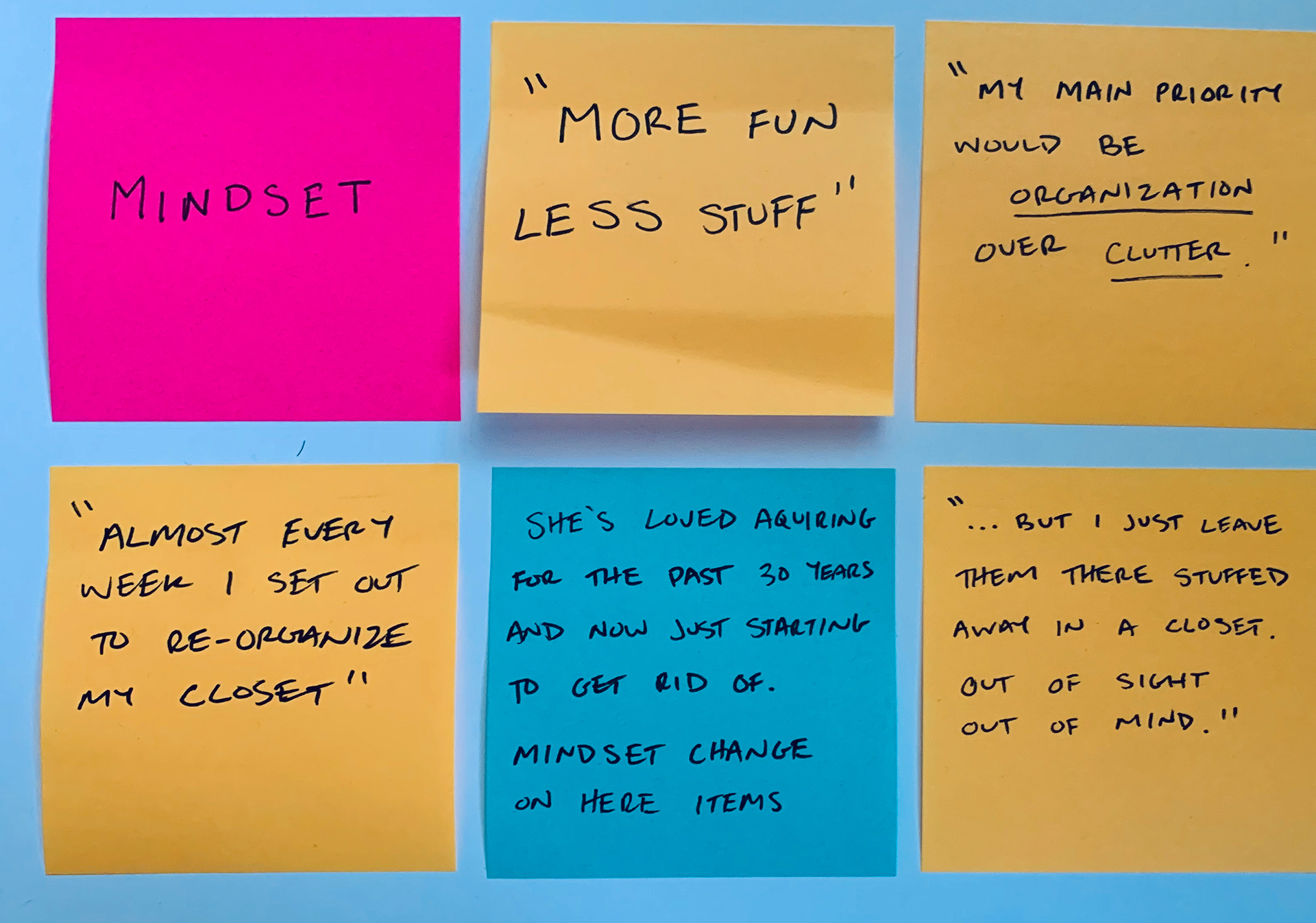
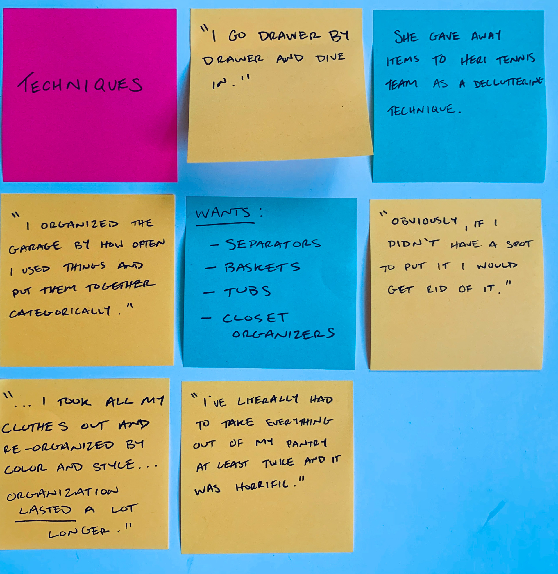
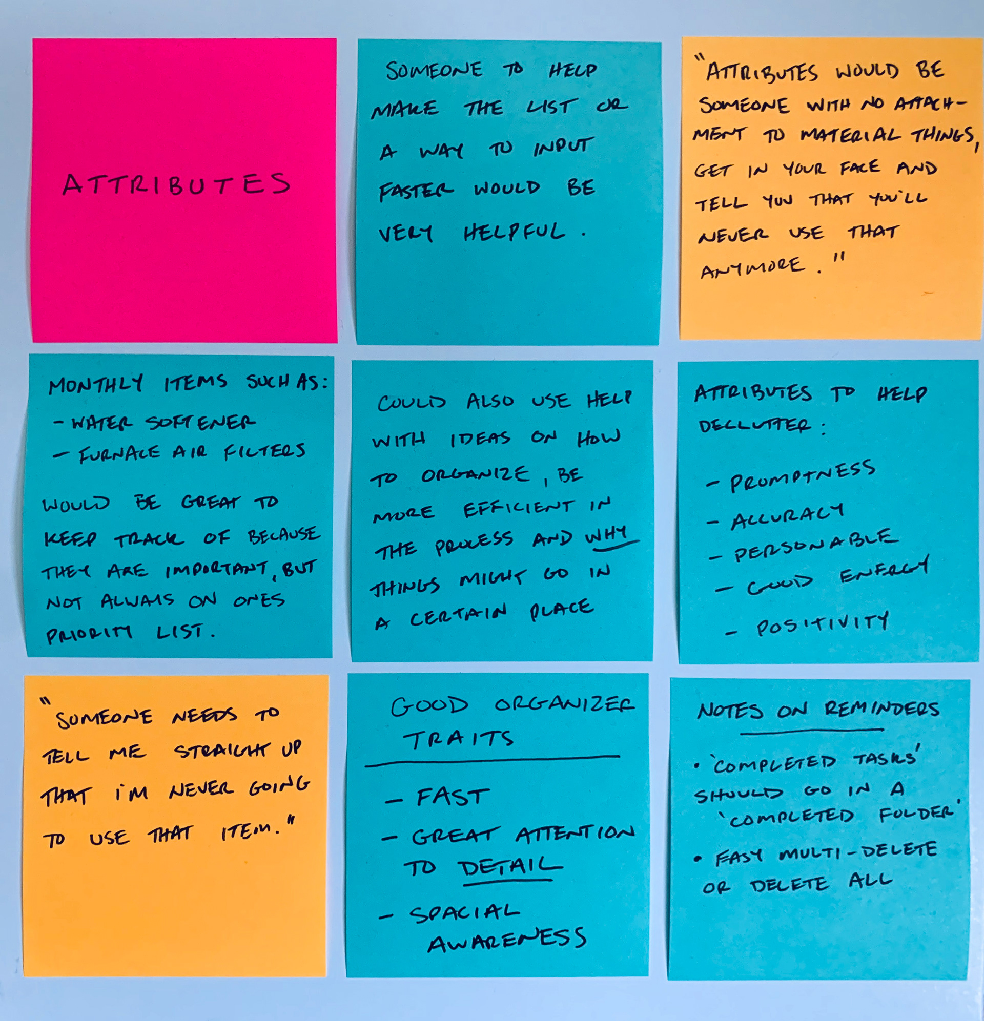
These led to the development of the following personas for which to design for, such as:
Mary, the House Manager:
She has a house to run, appointments to attend, a profitable rental property, and kids to raise. You will often find Mary multitasking with the best of them and solving everyone’s problems. She does not often have a moment to herself until late at night. She uses this time to get everything in its place and ready to go for the next day. Mary thrives on efficiency and cannot afford to waste time looking for things or information and would love an app that could help her out.
Steve, The Information Stickler:
If you need to know the price and description of those shoes you got from DSW in the summer of 2015, Steve is your man. He has a filing cabinet for his finances and a room for his receipts. Well, not really a whole room, but you get the idea. Steve thrives on his ability to organize information and stay on top of his purchases. This can be a blessing and a curse as he has various paperwork history that could fill a small pool. He would like to dispose of most of this clutter and streamline his operation in a digital way.
These personas we developed from a broad range of potential users. After determining that anyone could have a use for the app, I deduced who would really take advantage and benefit the most from its capabilities. These individuals emerged as the users that would be able to get the most bang for their buck, and therefore would have the highest probability to be successful with the experience.
MVP & Strategy
After pouring over the data from the screener, interviews, personas, and competitive analysis I determined these three components to include in an MVP (Minimum Viable Product) that would benefit a user:
• Organizing larger areas into specific classifications called locations.
• Finding valuable, information-heavy products inside those classifications and entering them as items.
• Entering details fundamental to the location as a whole as location notes.
I also developed some HMW Statements to answer to measure the success of the app:
Sketches & Wireflows
I started to conceptualize what red routes might look like in some basic forms. Apple’s current Notes app was an inspiration as I worked through iterations. As the app began to take shape on paper, I realized that user flows would not be complicated due to the simplicity of the experience (3-4 screens maximum). Some preliminary sketches explored what certain screens could begin to look like:
From here I proceeded to facilitate five guerilla user testing sessions using Pop by Marvel. These sessions helped narrow the scope as I moved on to low-fidelity wireframes. This led to a concrete concept of navigation and information architecture.
Usability Testing
Extensive usability testing was completed through a wireframe prototype as well as two separate high-fidelity mockups. I tested with many of the same users throughout all phases; however, since the problem changed halfway through (see Problem & Idea), there were new users for the last two prototypes.
The feedback I received was positive with some constructive criticism that led to minor changes along the way. The changes made dealt with wording, navigation, and some extra features to be added. Most users were able to complete the scenarios easily, while a few needed clarification or assistance to help complete the journey.
Summary
Upon reflection, I wish I could have spent more time in the research and interview phase of the new problem. With time and project constraints, I was not able to start the project from scratch, but was able to repurpose usable data from old research. Having pertinent research would have allowed me to produce a more seamless experience for end users.
Overall, I am very pleased with how the project came together and the solution that was created at the end. The problem itself was probably the most challenging portion of the project, to understand holistically what was being solved for and make sure it was useful. In the end I believe the prototype performed well and created a space to transfer physical information into a digital, organized space.
