Project Overview
We had been working with a basic style guide in Sketch to manage several different products with a component library that seemed to change with each project we entered. When presented with updates to our user flows, a certain component, or asked a specific standard by development, it was difficult to provide consistent answers. After a couple months of learning the products and seeing where our pain points were, we decided it was time to take action. We set out to get more organized and build out a proper design system.
Original Online Banking style guide and component library based in Sketch
Original CU*Publisher style guide and component library based in Sketch
Problems to Solve
To get organized and give our team and development the best chance for success, there were a number of areas we needed to address:
1: Too Many Unknowns
A lack of documentation to accompany our components and flows left us having more questions than answers. What is the correct error state to present on this input in this given scenario? How many pixels of padding does this footer require given this specific set of elements? Are the given variants of this component an exhaustive list? What has been done before and where is it?
2: Inconsistency
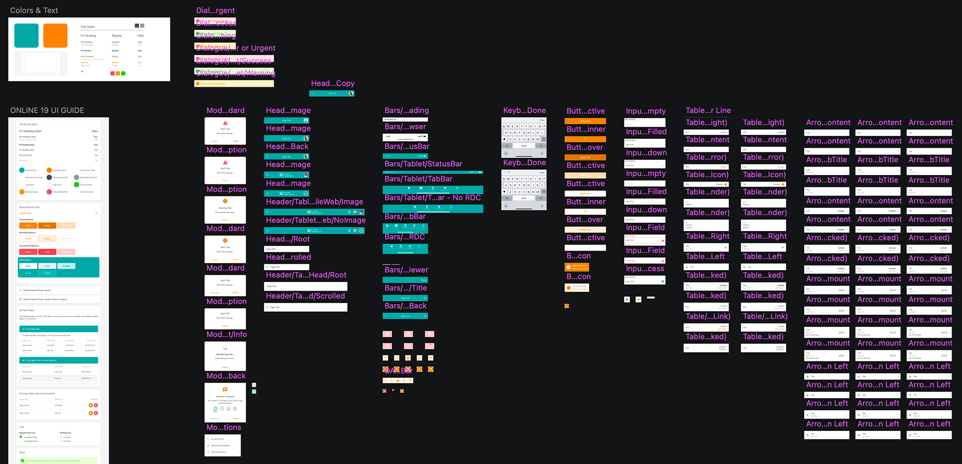
As I noted above, there was an established style guide and component library, but very little consistency across shared files and projects. Some components were linked, some weren't. Naming conventions changed from file to file, the specificity of file structure was so nuanced that it became rigid, and component browsing was an arduous process.
An example of searching for a component in Sketch and naming conventions.
An example of a component (variant) name. It followed a general breakdown of: Product / Size / Focus / Clarifier
3: On an Island
In its current state, this library was a UI kit that only benefitted designers and wasn't referenced as a hub of standards & truth for the entire team. Developers didn't have influence or input and that led to an awkward handoff that usually included delays and edits on both ends. We wanted to turn that idea on its head where the system would not only be beautifully designed, but also code-friendly. This was an absolute must as our team grew in both the design & development realm.
We attempted to mitigate these challenges while still using Sketch for a number of months.
• I remember going into almost every file and changing each file name separately in an attempt to simplify the structure.
• I recall consolidating several symbol libraries into one file to reign in some of the inconsistency and compartmentalization of each file.
• There was a time I even had to add color and text styles to the library so we wouldn't have to manually use the color picker each time.
We continued to fight the software to accomplish our work until we finally decided we needed a fresh start to build it out right.
Along came Figma, our white knight, that changed our workflow and system for good.

The Sketch to Figma Switch
This really was the perfect time to make something happen. Figma was making a significant name for itself with some robust features, highlighted by auto-layout and it's seamless collaboration. Better yet, you could import a Sketch file and have all your editable content in a matter of seconds. However, each file was on its own, no library, no master components, no shared elements. It was time to give those a home.
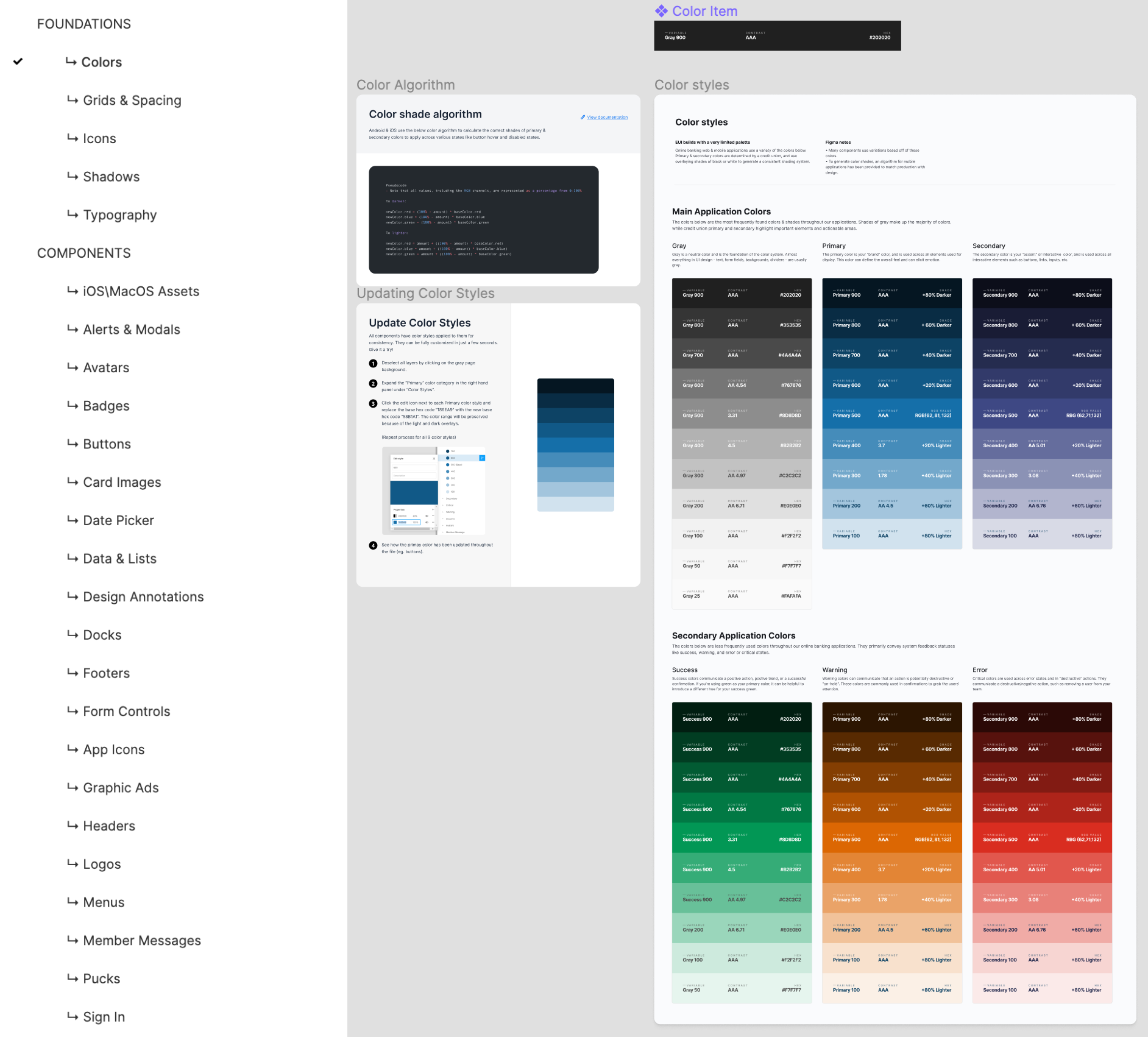
First: Foundational Elements
Consistency and organization had to start at the foundational level. Cornerstones to our system included: typography, colors, spacing, padding, shadows, & icons. These elements would be embedded into the Figma design, easily retrievable, and most of all: smart. Our foundational pieces would be interwoven so tightly into our designs and flows that even a massive design change would feel very simple to us.
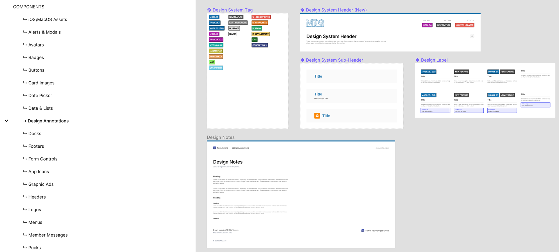
Second: Smart Communication
With foundations taken care of we needed to turn our attention toward another crucial piece we were missing: communication. With Figma being highly collaborative between stakeholders, developers, and designers alike, we developed a way to annotate and organize our flows. We created headers to house our flows that provided a descriptive overview. Design labels would provide clarification to developers and tags would help maintain statuses of each flow set. Updates on projects were as simple as grabbing a link to a certain user flow, sending it out, and team members could collaborate in real time.
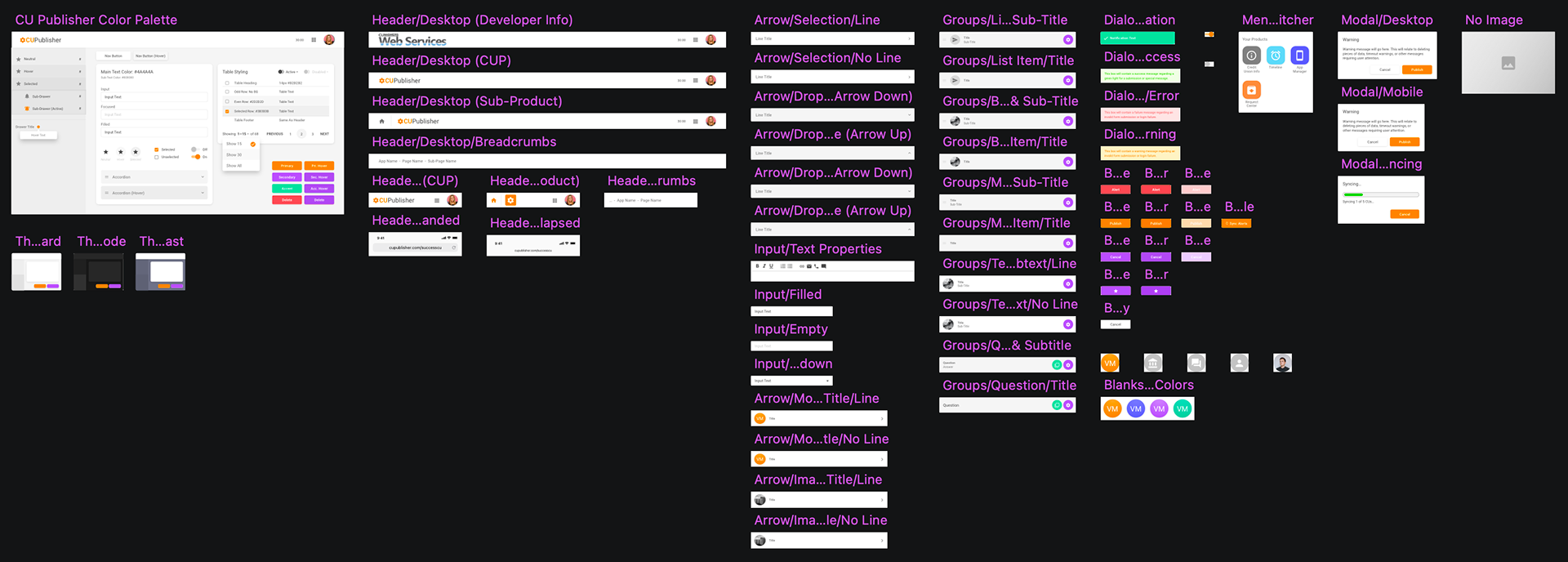
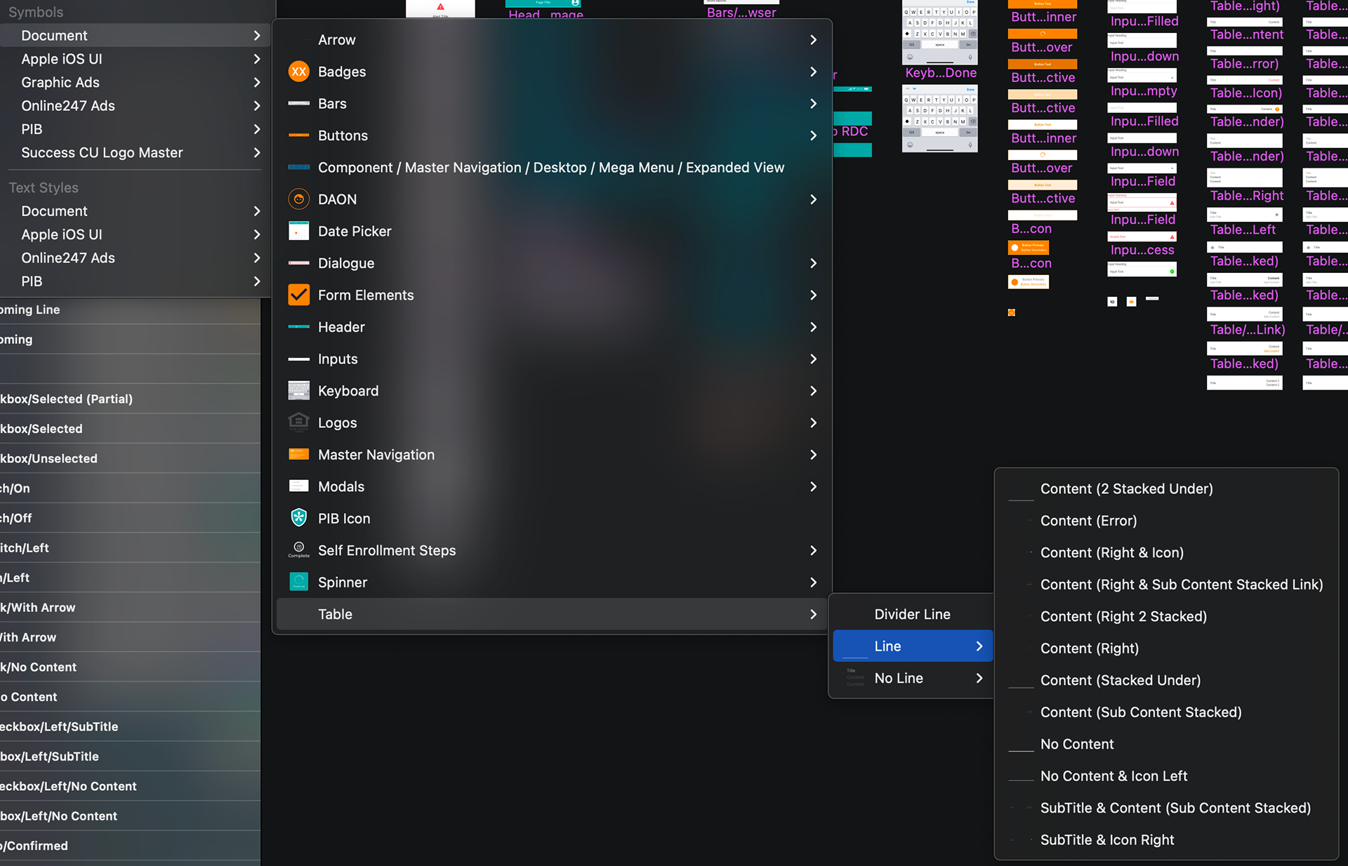
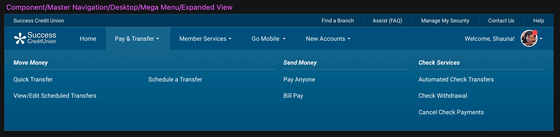
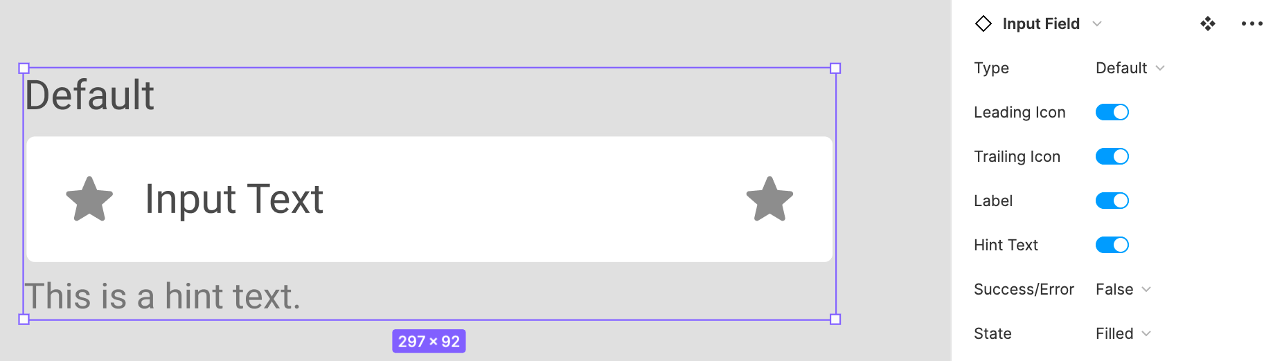
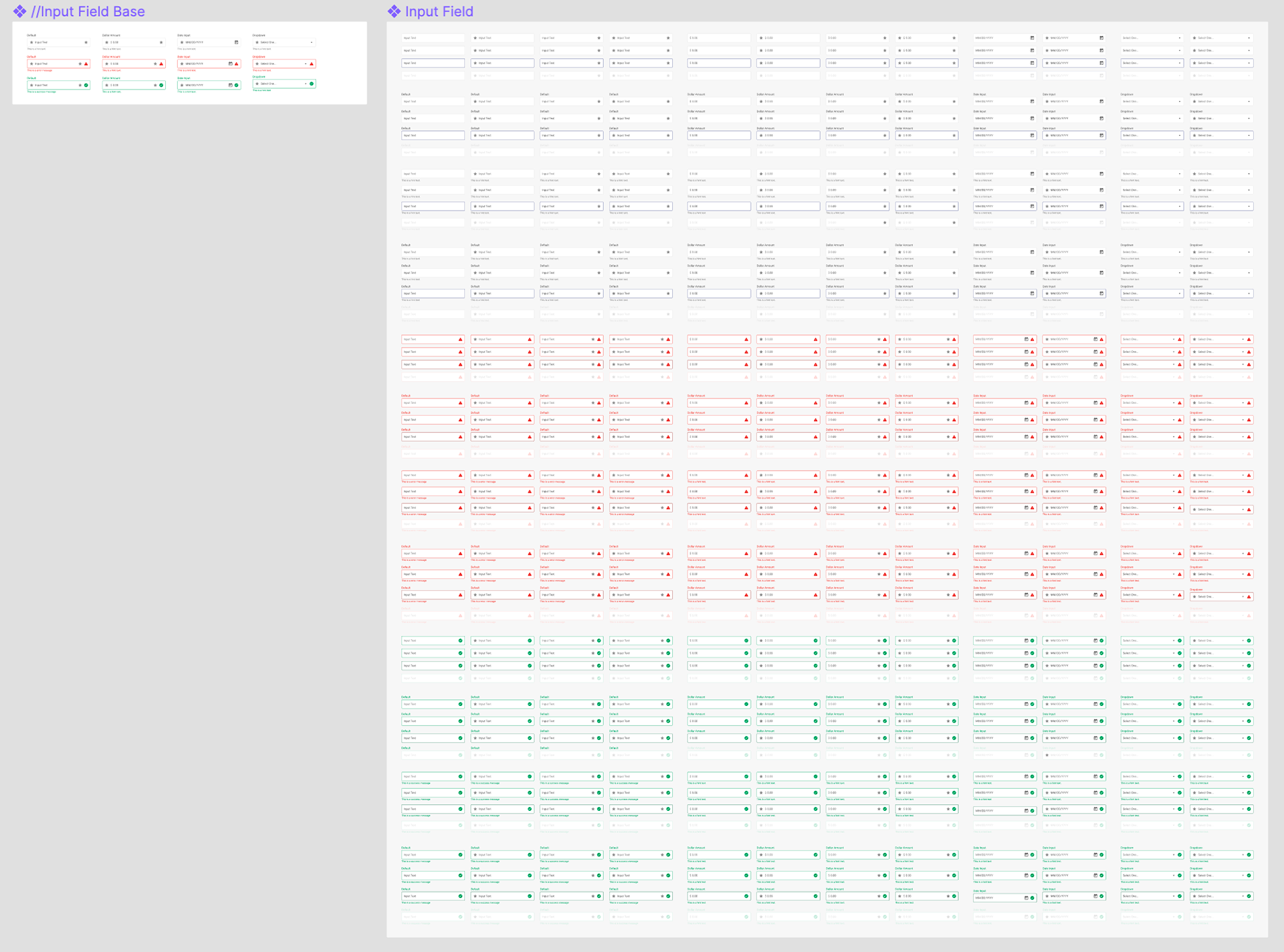
Third: Variant-Heavy Components
The big undertaking...and this took the vast majority of our time. Behind the scenes it looks a lot like Sketch, however, we started with base components that housed every variant we wanted to have access to. When actually putting the component to work, there is an elegance to its flexibility and power. With Figma's smart visibility features, simply hiding certain portions and exposing others let us build out hundreds of variant options for one component. All responsive, repeatable, and easily modified. By also using standard rules in the variant structure such as "yes/no" or "on/off", Figma creatively houses these differences in a toggle. With a few simple clicks you can mimic any state or situation a developer would need to see.
When it All Comes Together
By using our foundations to create our base components, modifying those to create our variant structure, and by applying that method to our expansive component list, we finally had the tools to build out our flows. The last piece of the puzzle was using Figma's Auto Layout function to create responsive & smart screens. With this new system, I'd guess that we improved our efficiency and workflow by around 200%.
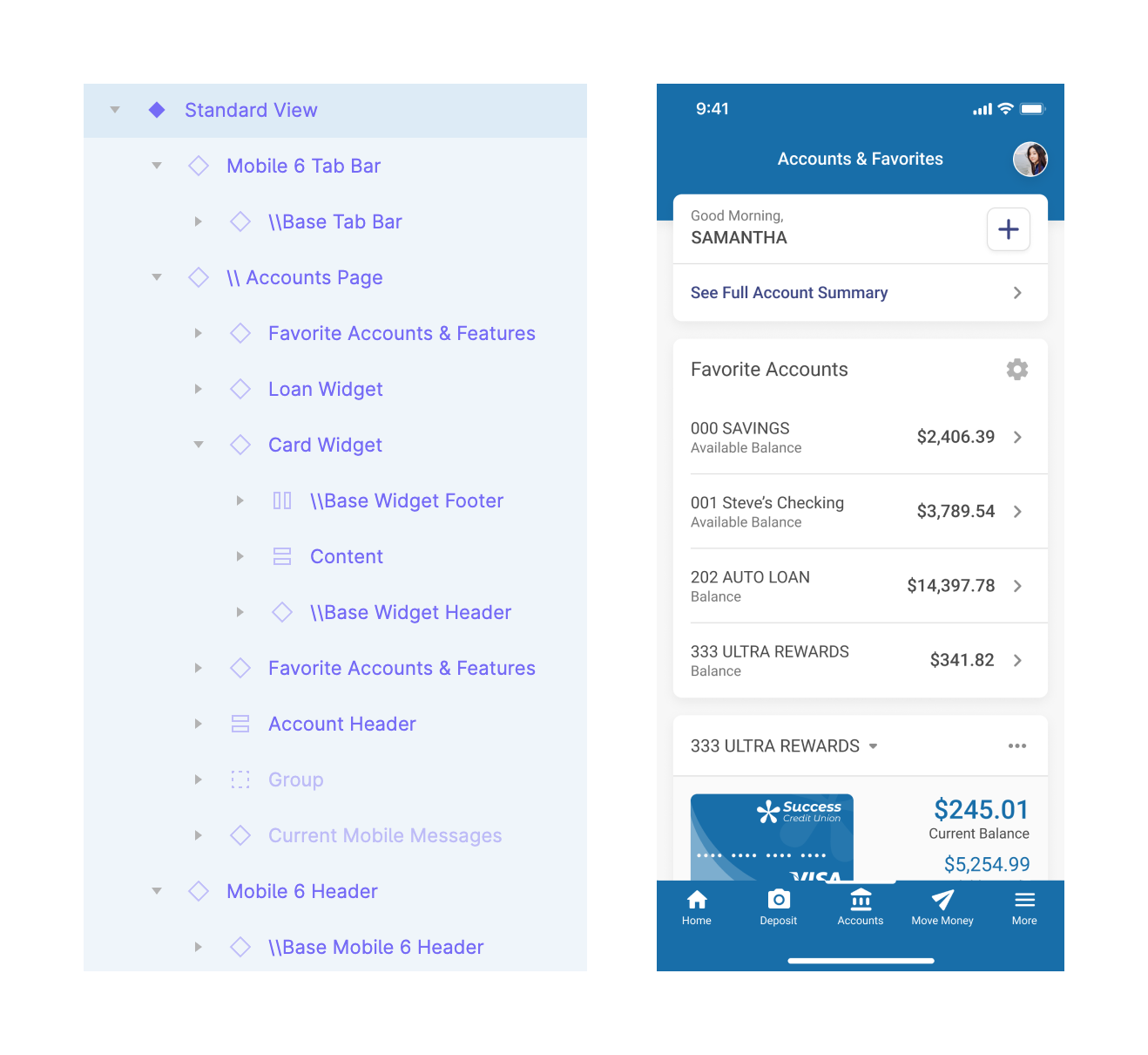
Example of a layer breakdown with our new system and the accompanied view.
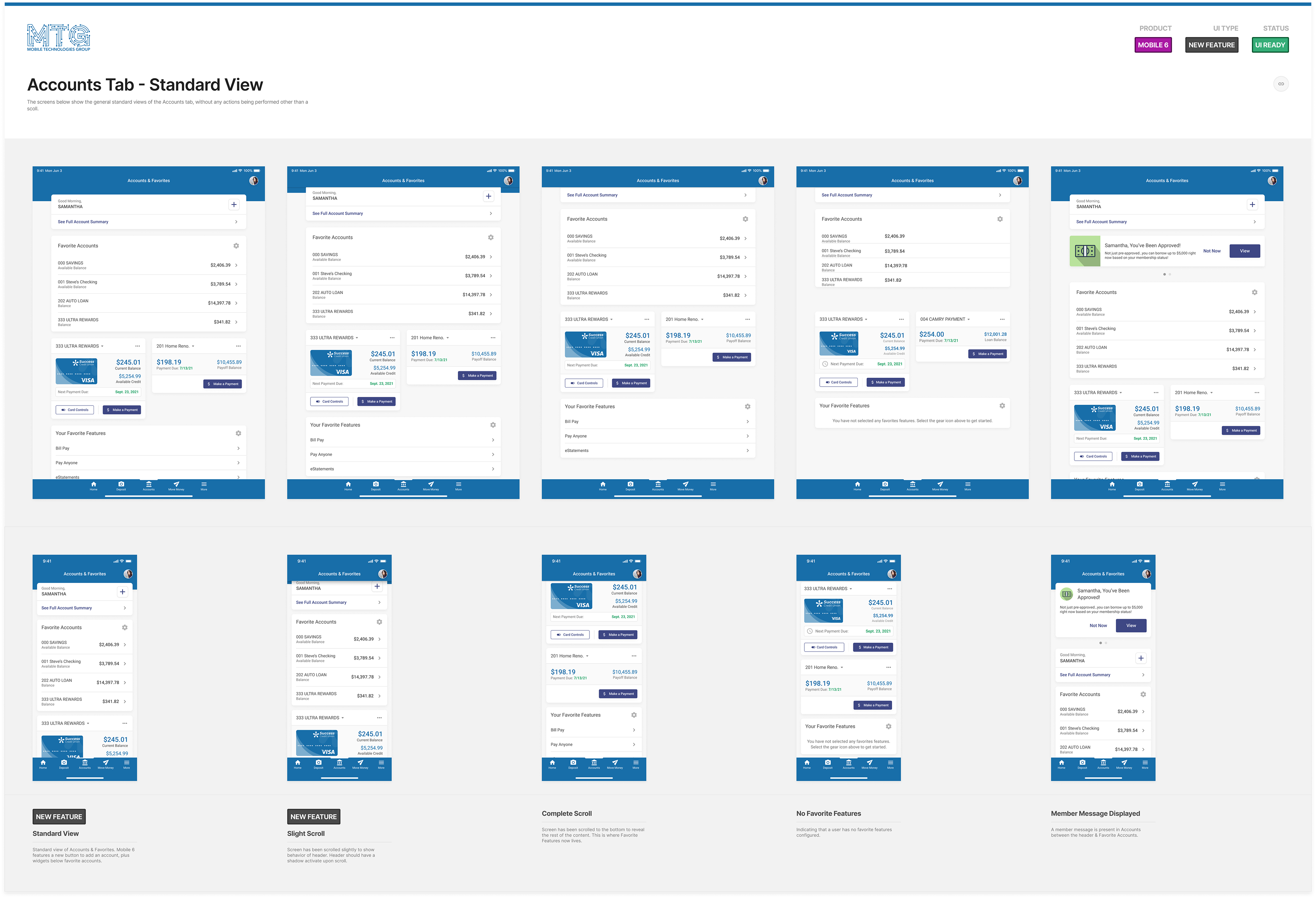
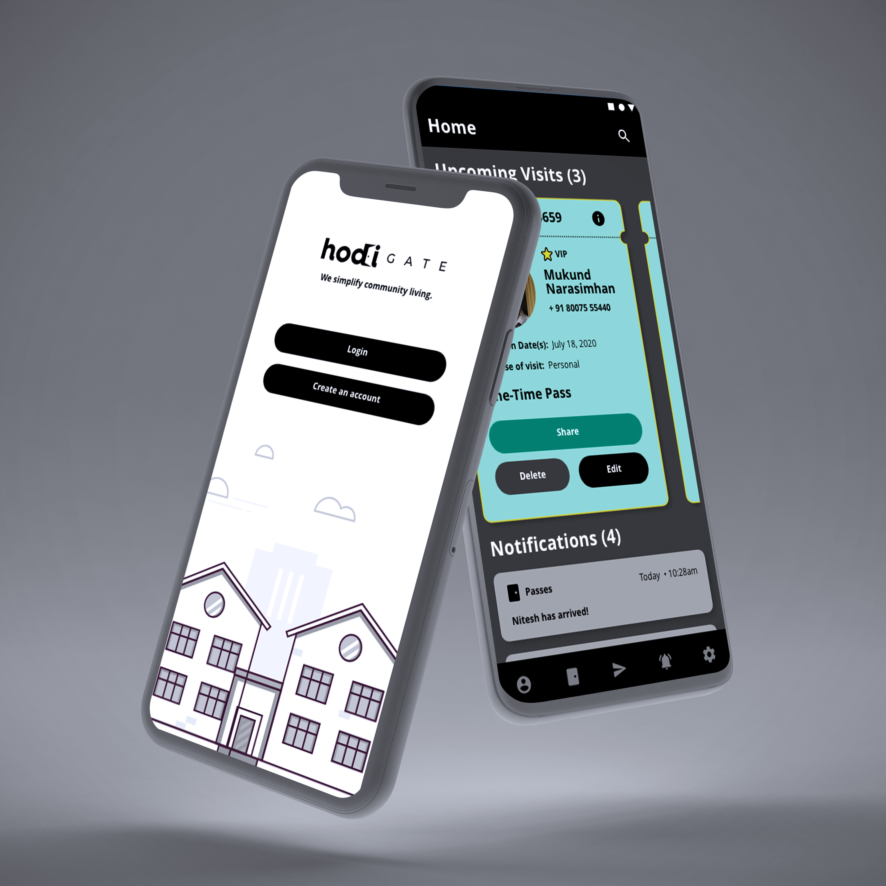
Different variations to our Accounts tab found in the newest update of our mobile app.
Documentation & Onboarding
We weren't looking to only provide documentation for developers, but also those in charge of maintaining the design systems. It's been slow process, but we're putting together documentation sheets to keep the system running like a well-oiled machine. We also included a "Getting Started" guide to help onboard any new team members and get them up to speed.
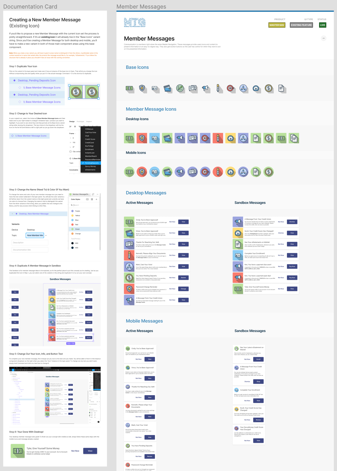
Here's an example of a sheet put together on how to create a new variant for a feature called "Member Messaging."
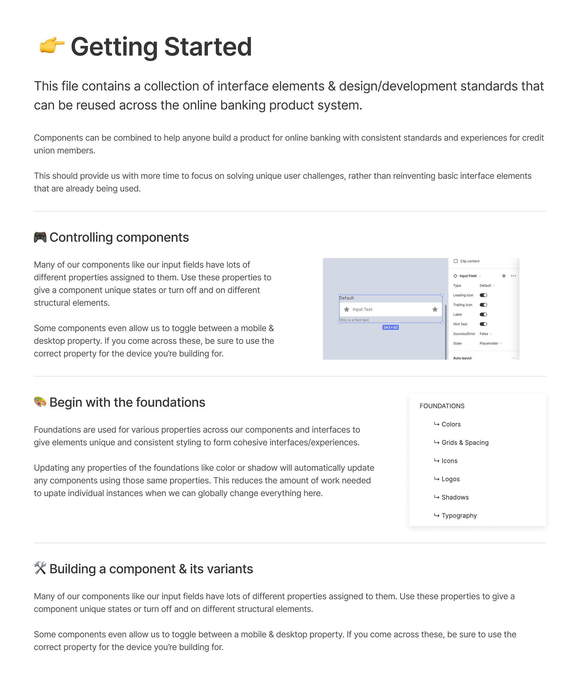
Our "Getting Started" guide to help onboard new members to the design system.
Summary
When I think about when I first started at CUA and all the searching and deciphering I had to do across our products, I can't really imagine I used to do it. The process was clunky, full of questions, and many assumptions were made. This lead to several inconsistencies, compartmentalized products, and disorganization as whole.
What we have now is still improving each day, but we are bringing consistency to our components, precision to our flows, and collaborative clarity so everyone is on the same page. Moving forward as one compact unit with a centralized source for standard and truth is exactly what we envisioned when building out these design systems.