Problem & Idea
SAVR Recipes is a new startup that wants to make it easier for people to follow new recipes, and cook great meals at home. I took a literal “step-by-step” approach to the problem to create an experience that focused on minimizing mistakes, keeping users on track, and reducing stressful experiences.
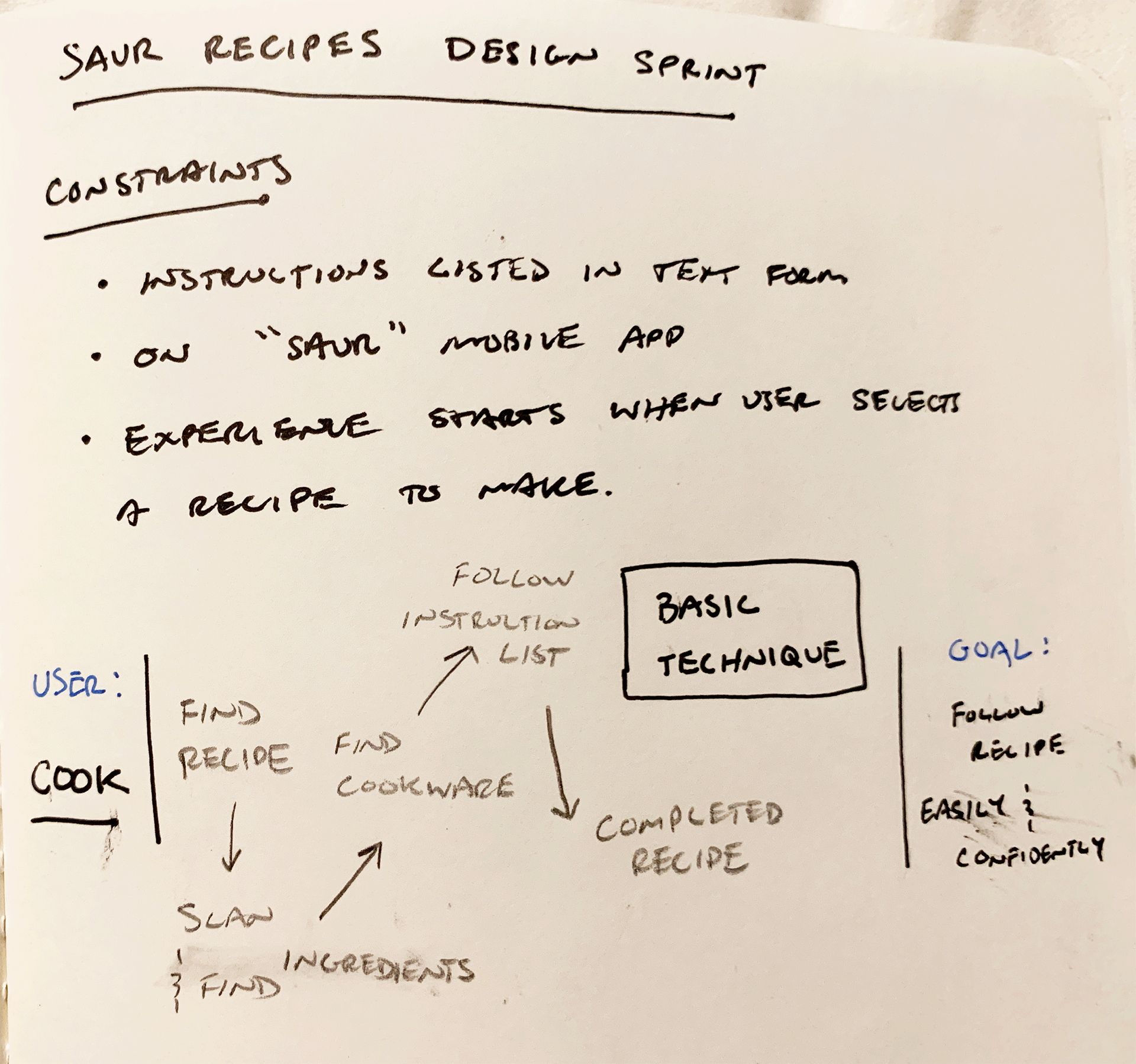
I was outfitted with some established research that included eight different users and their pain points, one user interview, and one persona. A few constraints of this design sprint were that instructions had to be in text form, it had to be app based, and the experience started when the user selected a recipe.
This was a modified Google Ventures (GV) design sprint for one that followed a prompt created by Bitesize UX. Due to this modification, I carried out all aspects of strategy, prototyping, and testing on my own.
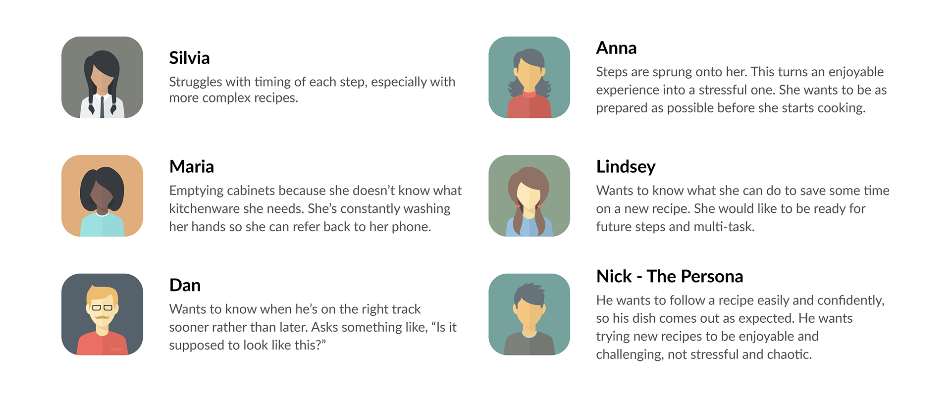
Persona & Pain Points
Some pain points and persona goals that stood out while reviewing the research:
As I sifted through research to understand the problem, I developed some questions that I would later test for. The technical jargon needed to change a little bit as well to…
How might I…?
• create an easy-to-follow recipe?
• help minimize mistakes made on the recipe?
• keep the experience of making a recipe enjoyable instead of stressful?
• prepare the user so they stay on track with the recipe?
User Maps
With a better understanding of the problem I moved on to develop some potential user maps. To get a feel for what a normal map might look like I poked around blogs and recipe sites to establish some common themes.
Early Findings
Luckily, a user journey through a recipe is not that complicated. You have your core elements such as ingredients, cookware, and instructions and that allows you to create the final product. If you put everything together at the right time, in the right order, and with the right measurements there shouldn’t be an issue, right? I’m sure you and I can attest it is not always that simple, however I went searching for that coveted clarity and simplicity.
Lightning Demos
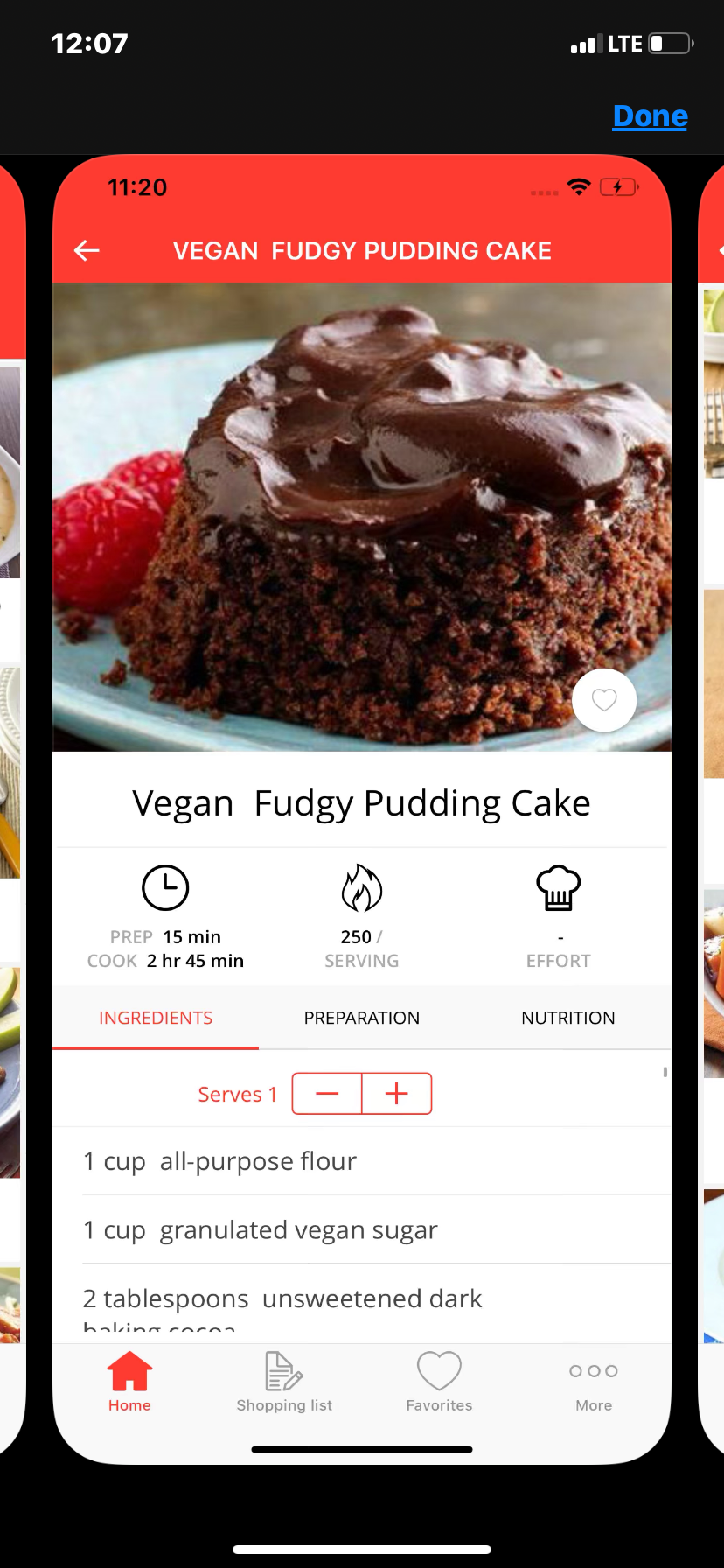
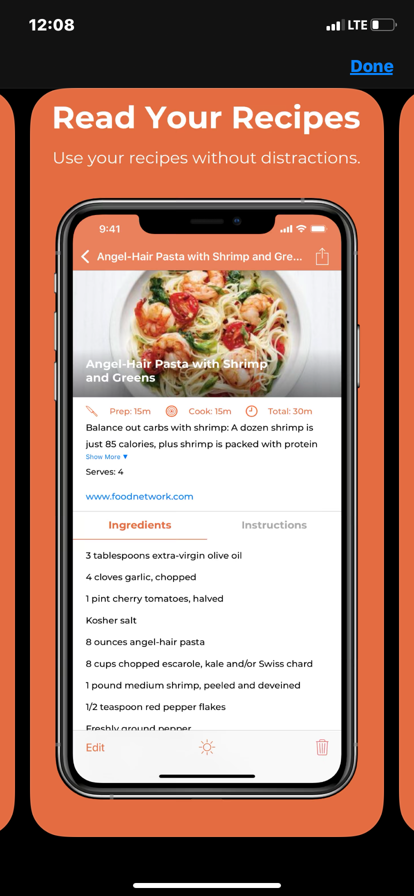
Lightning Demos are performed in a GV sprint to find inspiration and explore some great experiences already being used. I combed through the app store and found screens from multiple apps, such as Tasty, RecipeBox, and Healthy Crockpot Recipes that I enjoyed and looked successful.
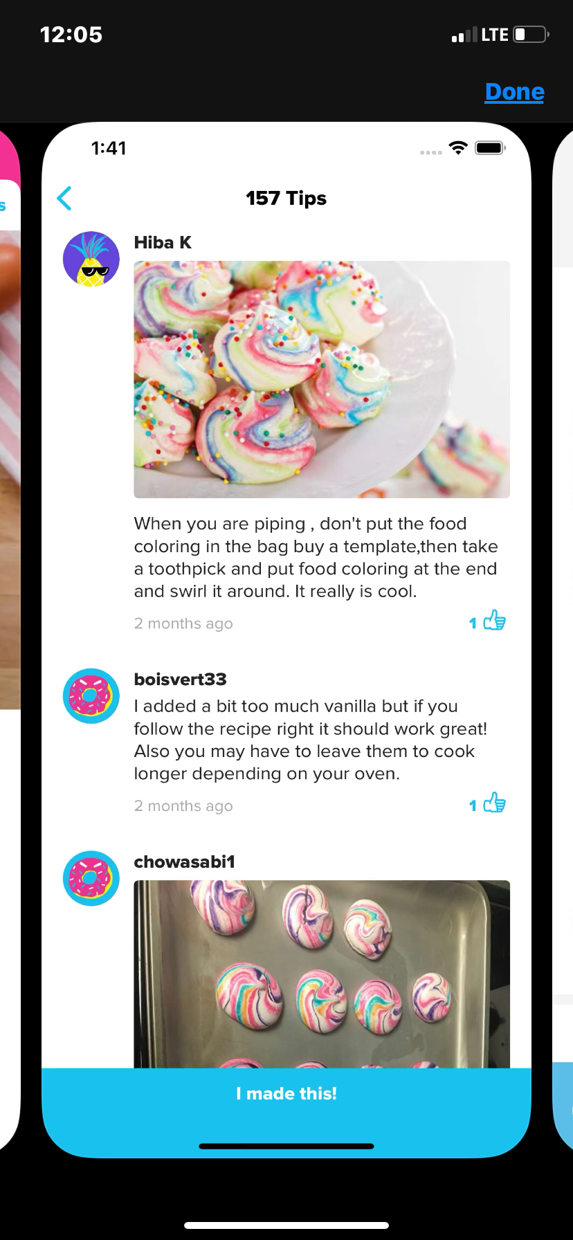
I thought the organization of information was well done and the colorful imagery let you imagine what the final product could look (and yes, taste) like. In Tasty’s app, their “step-by-step” allowed you to see a snippet of the recipe and an engaging visual to clear up any confusion. Their tips page is what really took the cake as it is a wonderful resource for users to get the inside scoop for better preparation.
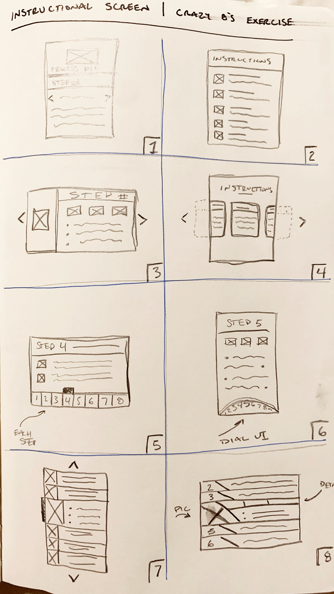
Crazy 8s
Once all the inspiration was there, the iterative process could begin. This process focuses on a critical screen in the experience where you produce eight different iterations in eight minutes. I established that the instructional portion of a recipe was most critical, so it became my focus for this exercise:
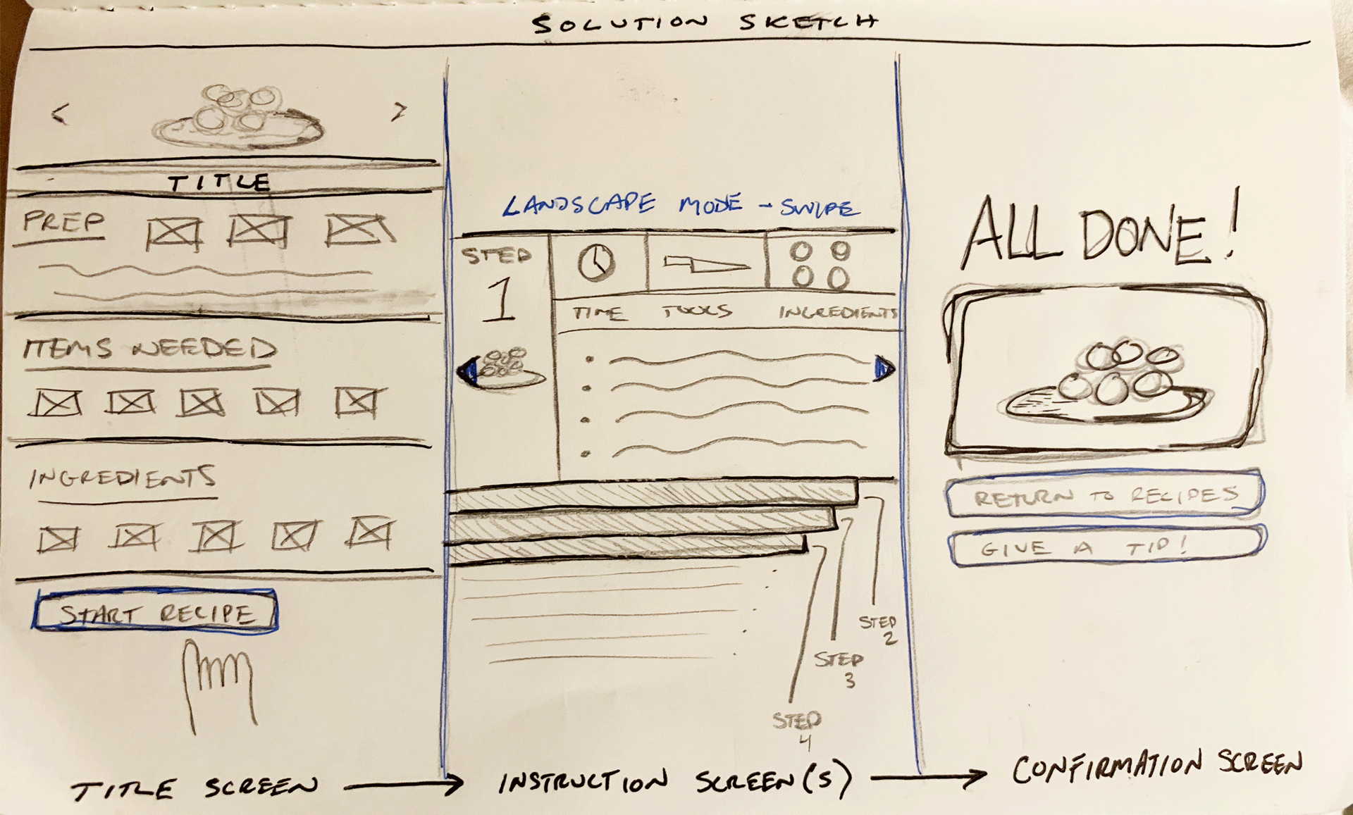
Solution Sketch
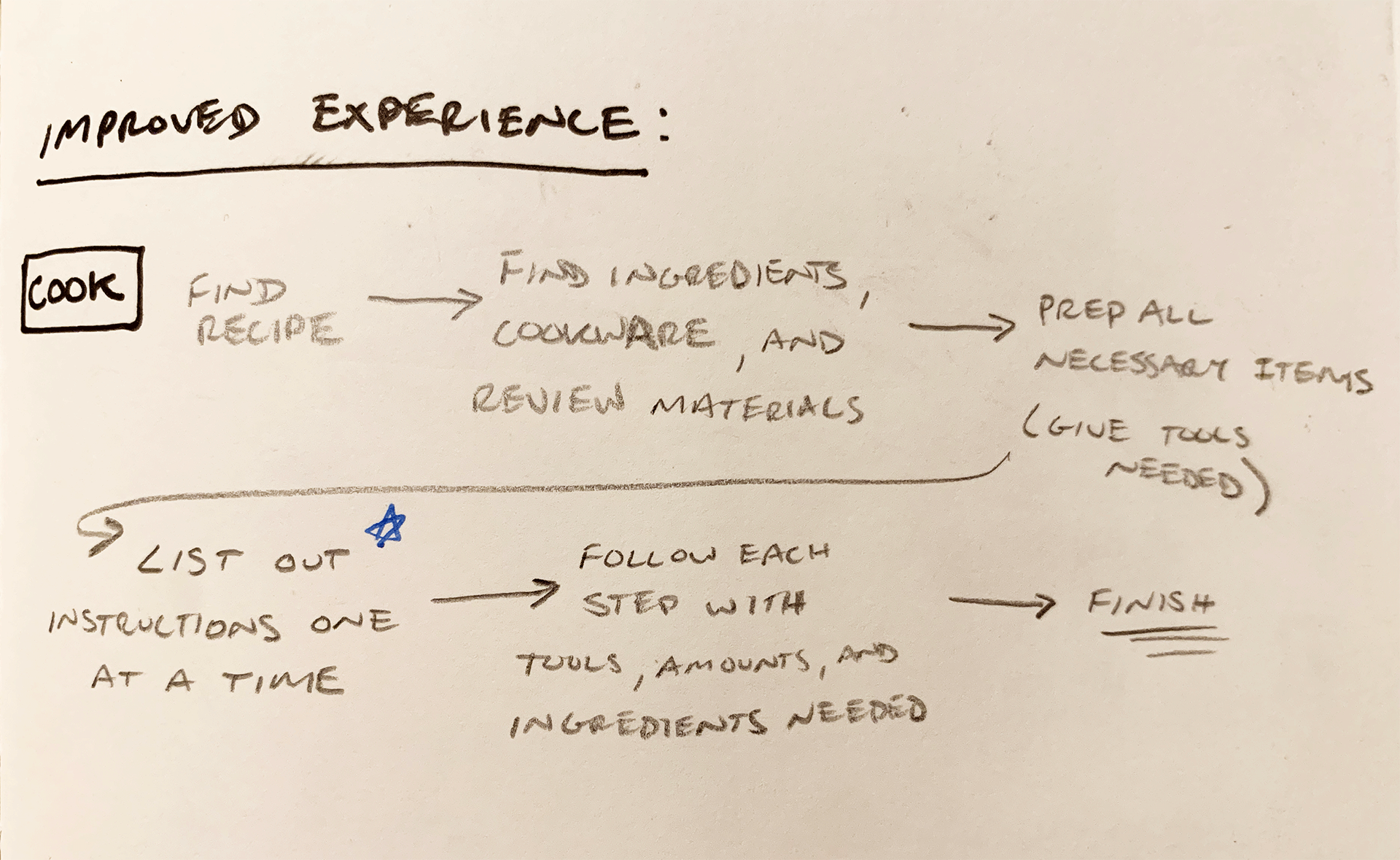
The instructional screen is where ingredients come together in sweet harmony and perfect timing. To get this right the information needs to be clear, free of distractions, and easy to look at.
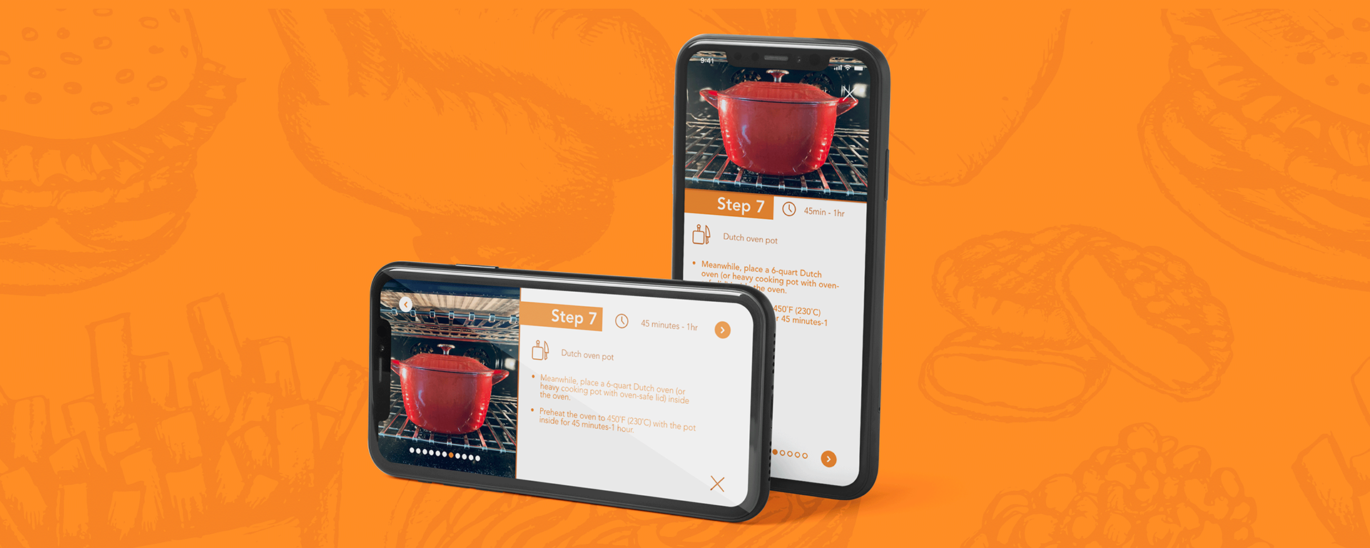
I went with box “3” for my sketch to move ahead with for a solution sketch. As I was creating I wanted to explore what a solution would look like both in a portrait view and landscape view. With this landscape view I can keep text large while still having multiple bullet points per page. It highlights your image, step number, and keeps pertinent details clear and obvious.
Storyboard
After the meat of the experience was formulated I moved onto storyboarding. First, I came up with my user journey through the recipe so each screen could be accounted for. I bracketed out sections that would fall under similar screens, and from there I sketched out a potential journey.
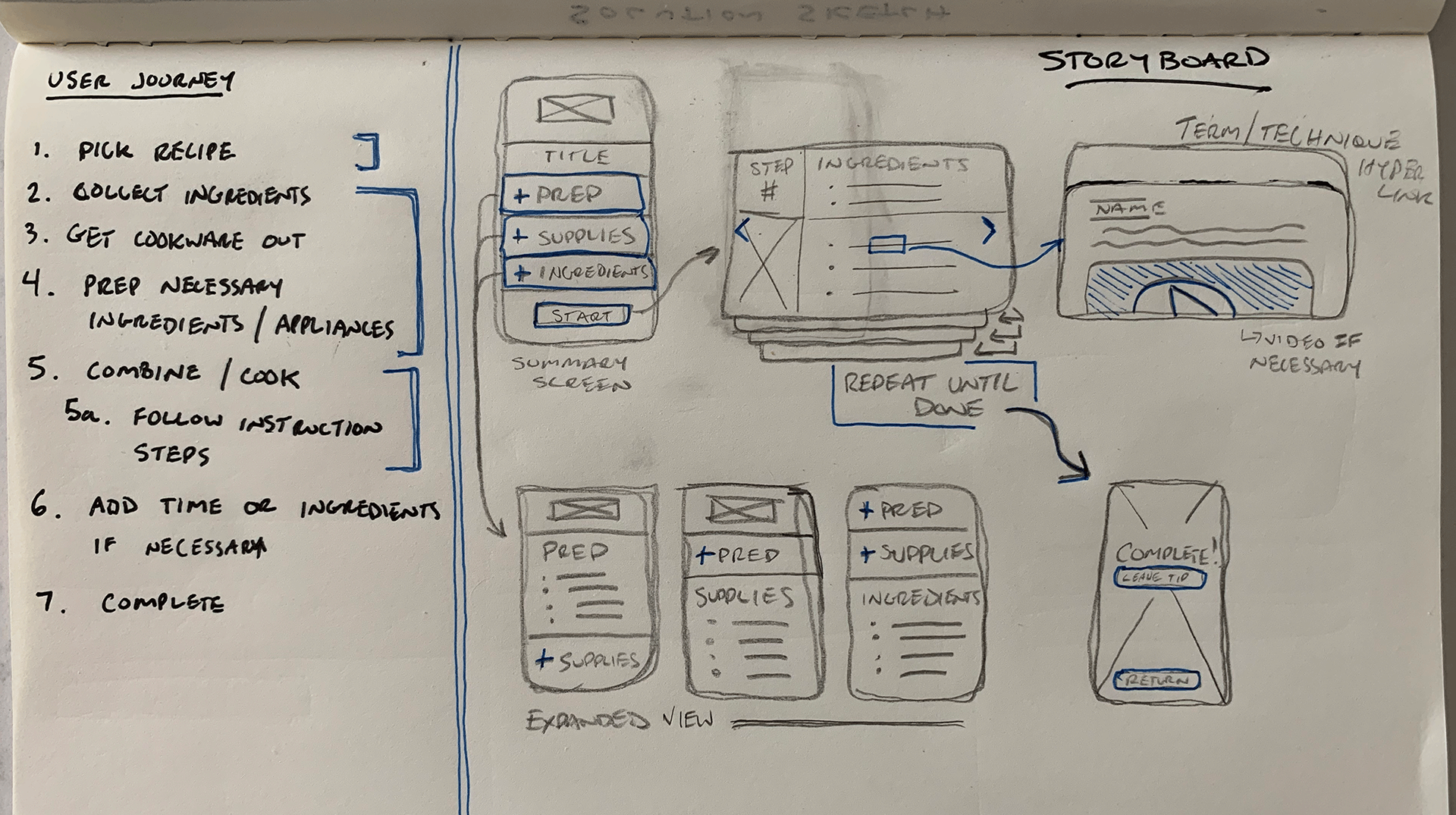
I concluded that the first four steps in the journey could be solved by a single screen with drop downs for each section. As for the steps of the recipe, each step would have it’s own screen. Different hyperlinks could be connected to key techniques or skills the cook might not be familiar with that would pop up when clicked on. Once the cook is done creating their recipe they come to a confirmation page where they can choose to leave a tip/review for future cooks or return to their recipe list.
Prototyping
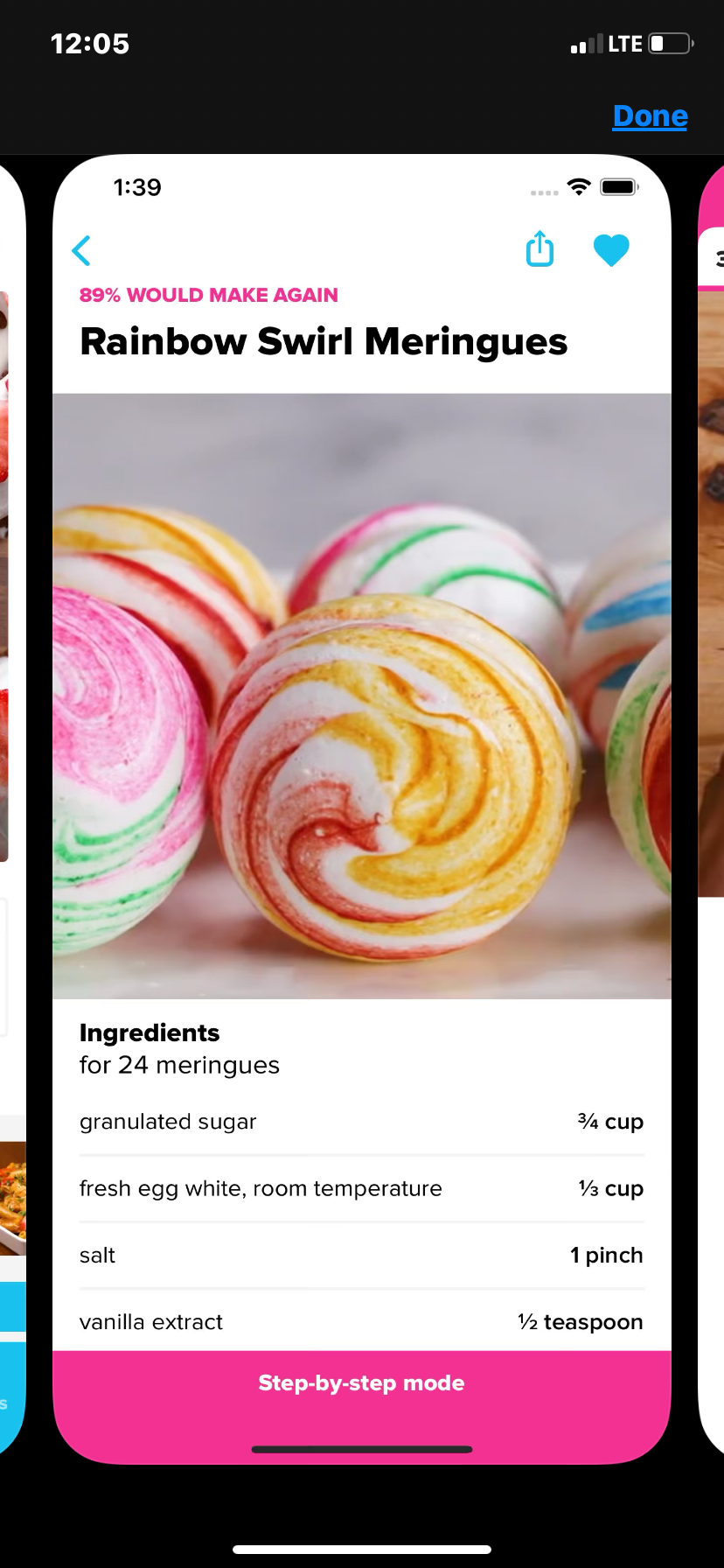
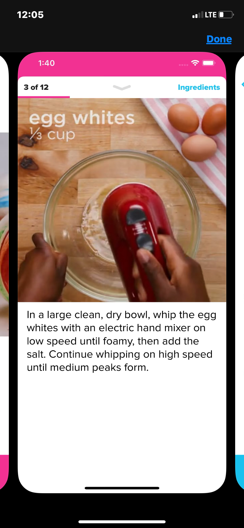
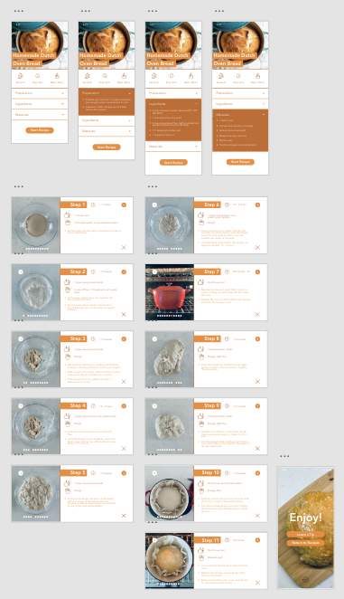
My prototype for Savr Recipes explored a “Homemade Dutch Oven Bread” recipe. On the summary page at the beginning are dropdowns that give some preparation tips and ingredients/materials needed. Once you start the recipe you’ll follow it step by step with each screen being a different step. Each step includes: time taken, ingredients /materials needed, bullet points for the step, and a picture of what it should look like. After the last step is a confirmation screen with options to leave a tip for other cooks or go back to recipes.
I wanted to see how the steps per screen functionality worked with users. It is surely different from the typical blog experiences that are popular and I hoped it could ease most pain points that users have expressed.
Goals:
• This experience minimizes mistakes made on the recipe.
• By aiding with up front preparation, users feel more on pace with the recipe.
• The experience is joyful and minimizes stress.
User Testing
Since almost everyone has followed a recipe or two in their day, finding participants wasn’t very difficult. In the heart of COVID-19 lockdown I had to stick to members in my “quarantine crew” for moderated testing sessions.
All of the participants made it through the recipe and confidently said they could follow this recipe with little issue. Many commented on how helpful each image was that accompanied the step to stay on track. There were also multiple who loved that each step described exact ingredients and materials, instead of just a list of each for the whole recipe.
There was also some very constructive feedback that I agreed would be helpful for a redesign. Some notes were:
• Moving navigation arrows to the bottom and back button to the top for a more recognizable interface.
• Invert the summary list so materials are on the top, ingredients middle, and prep at the bottom. This is the way the participant would do it when setting up for the recipe.
• Some participants found that the recipe changing to landscape during the instructional phase was distracting and would want to see it all the same orientation.
• Some thought that the preparation tab began the recipe.
• Ingredients and materials should be smaller per step for the instructions to stand out more.
I took this feedback from my participants and put together a refined prototype: