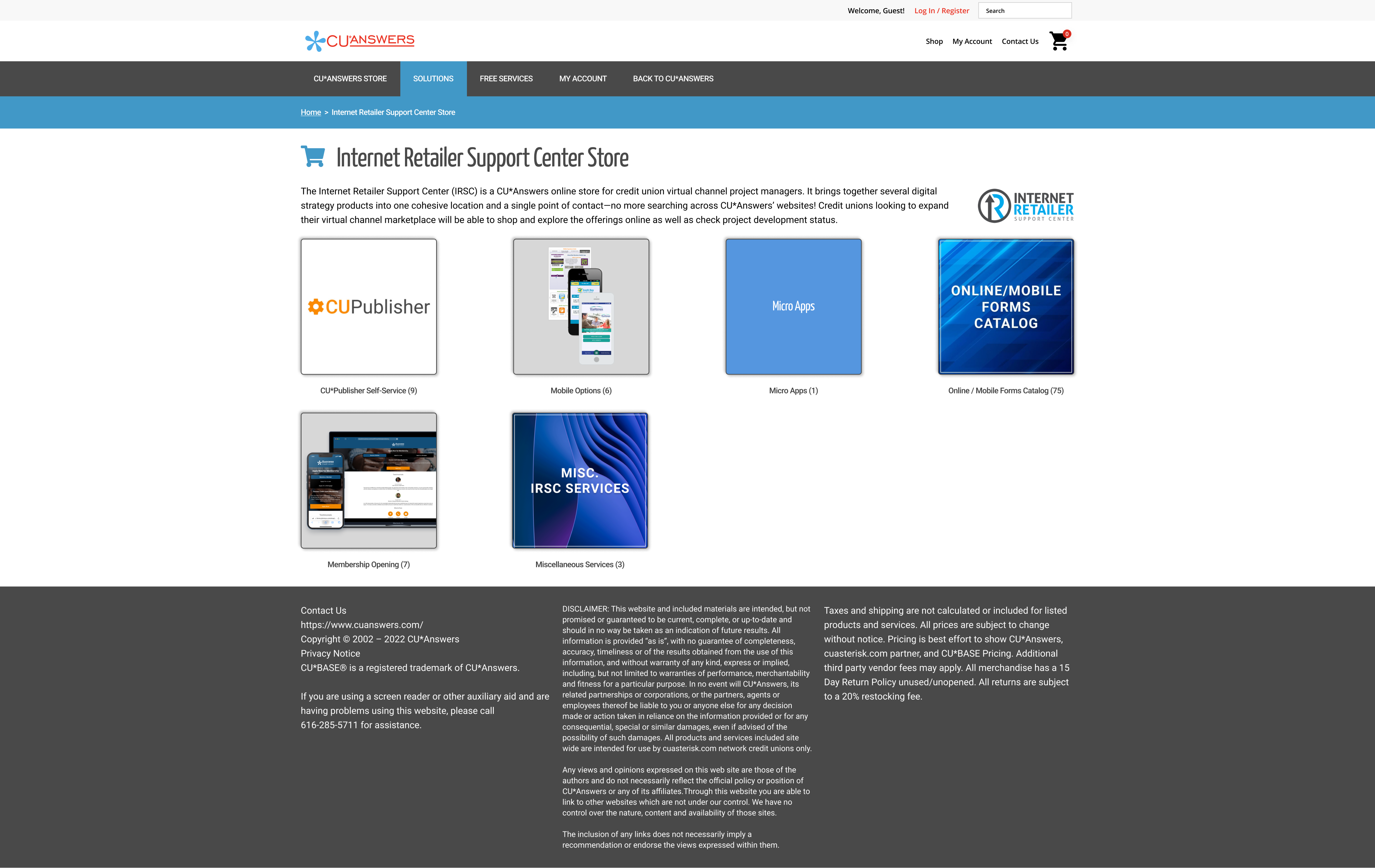
IRSC main page. The images shown don't reflect any personality or intrigue to the product they represent.
Overview & Goals
The IRSC store is the place where our credit unions partners go shopping for our software and services. The overall site is managed and operated by our Web Services department and my internal team works with the VP of Sales to market our products on this storefront. The VP would typically message me when we have an update or new product and ask for some images to accompany the product page. As it would go, I would go to that specific product file, dream up some mockups, and send them off. After the handoff, I'd periodically check the page to see if they were posted and would frequently see out-of-date UI or images not formatted correctly to specifications.
After two or three of these requests with the same outcomes, I took the initiative to formulate a better handoff process and improve the visuals on these product pages as much as we could from our end. This included making pixel-to-pixel replicas of the product pages, smart components that could swap out images with ease, and responsive looks for these templates.
Setting the Stage
To make sure I could accurately show how I intended the images to be shared, I mocked up three different page templates. In this way, when I created the images I could also put them in the exact scene they would be viewed in, eliminating any questions to how they should be displayed. Below, you'll be able to see the three different views (left to right):
• Main Page
• Sub-Page
• Single Product Page
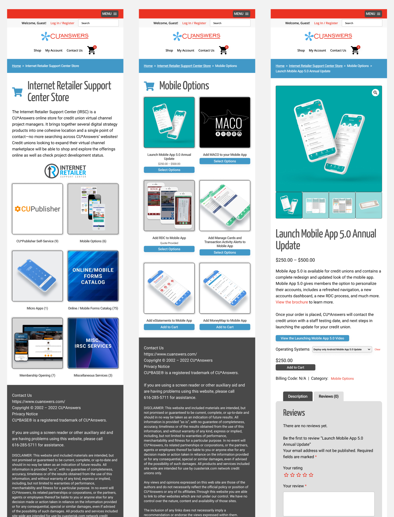
This shows the three different templates in their mobile views, all created with auto layout. Desktop views were also created to give extra clarity to how images would look on each device.
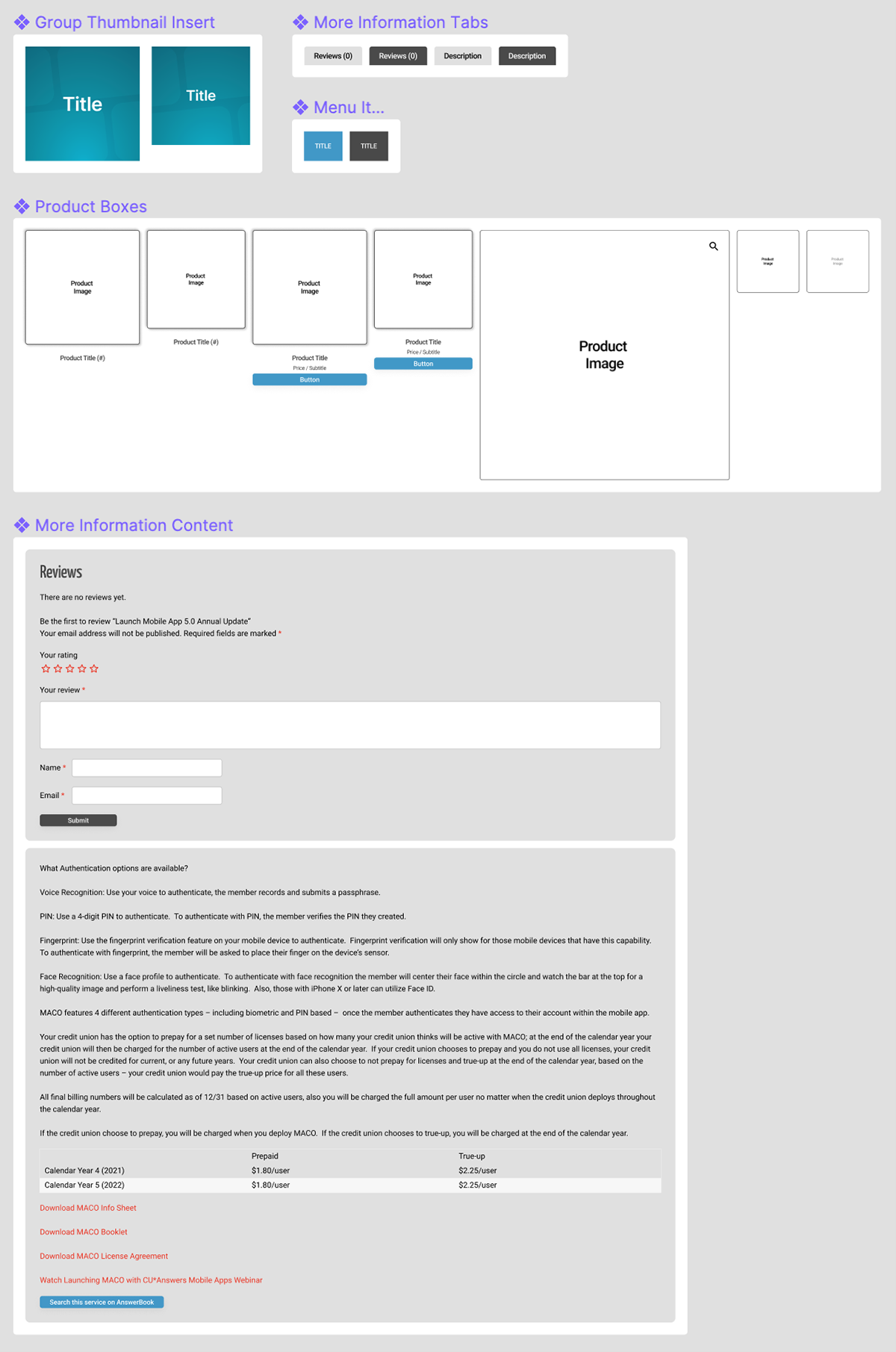
Utilizing Components For Quick Mockups
To make this process even quicker, I devised a plan to fill each image square with an <img> file instead of the longer process of:
1. Make an updated component with the desired design
2. Create a copy and copy / paste to the correct template
3. Make sure it's scaled to the exact size of the template filler
4. Since it's an instance of a component, once resized it must be overridden to accept changes.
By simply filling the master with an image, you can create an instance of the template and change out fills without and resizing or touching the design of the template itself. You go to your new design / "copy to PNG" / select the product image instance in the template, and paste! An image fill will automatically conform to the instance size, making it an incredibly clean and quick process.
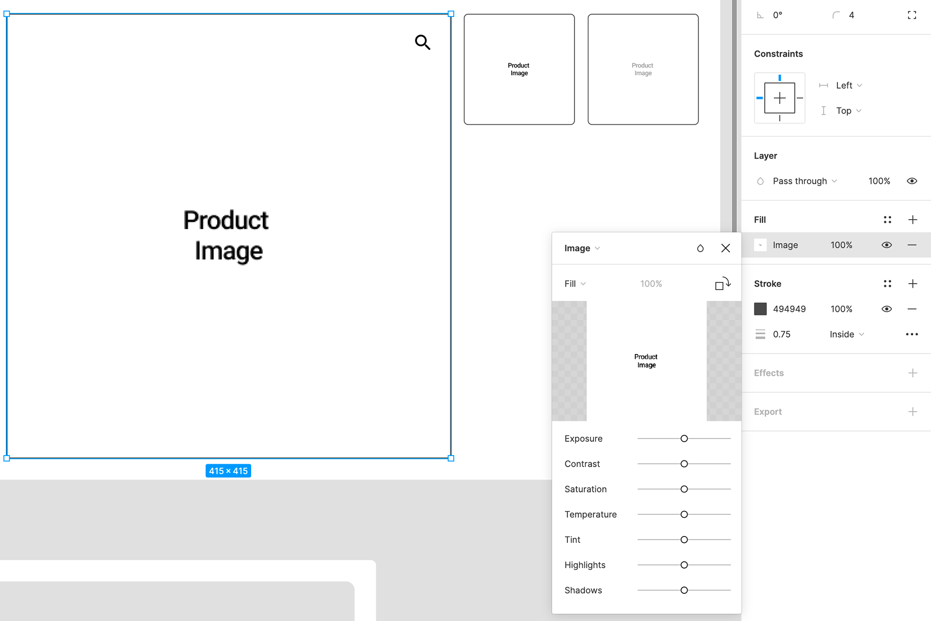
Each of these components uses an image fill, which speeds up this process considerably.
Success Story
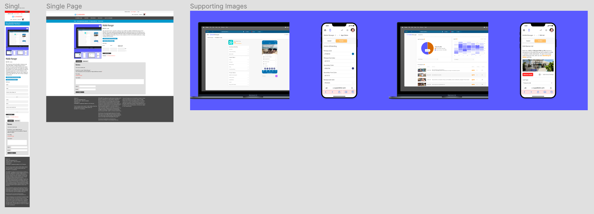
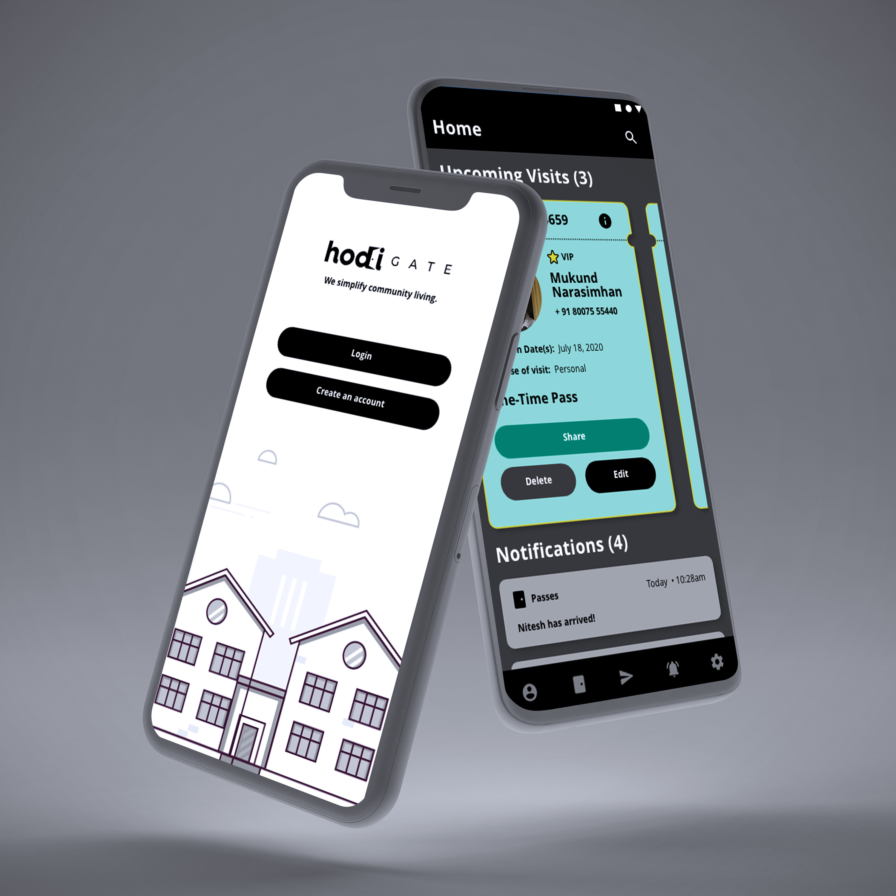
Once I had my templates good to go, I started churning out new product images for several products that were already listed on the store. The first success story using this method was with out newest update to our flagship mobile app. The handoff went extremely well and the VP of Sales appreciated the clarity the templates provided for the overall vision. Check out the live page here.
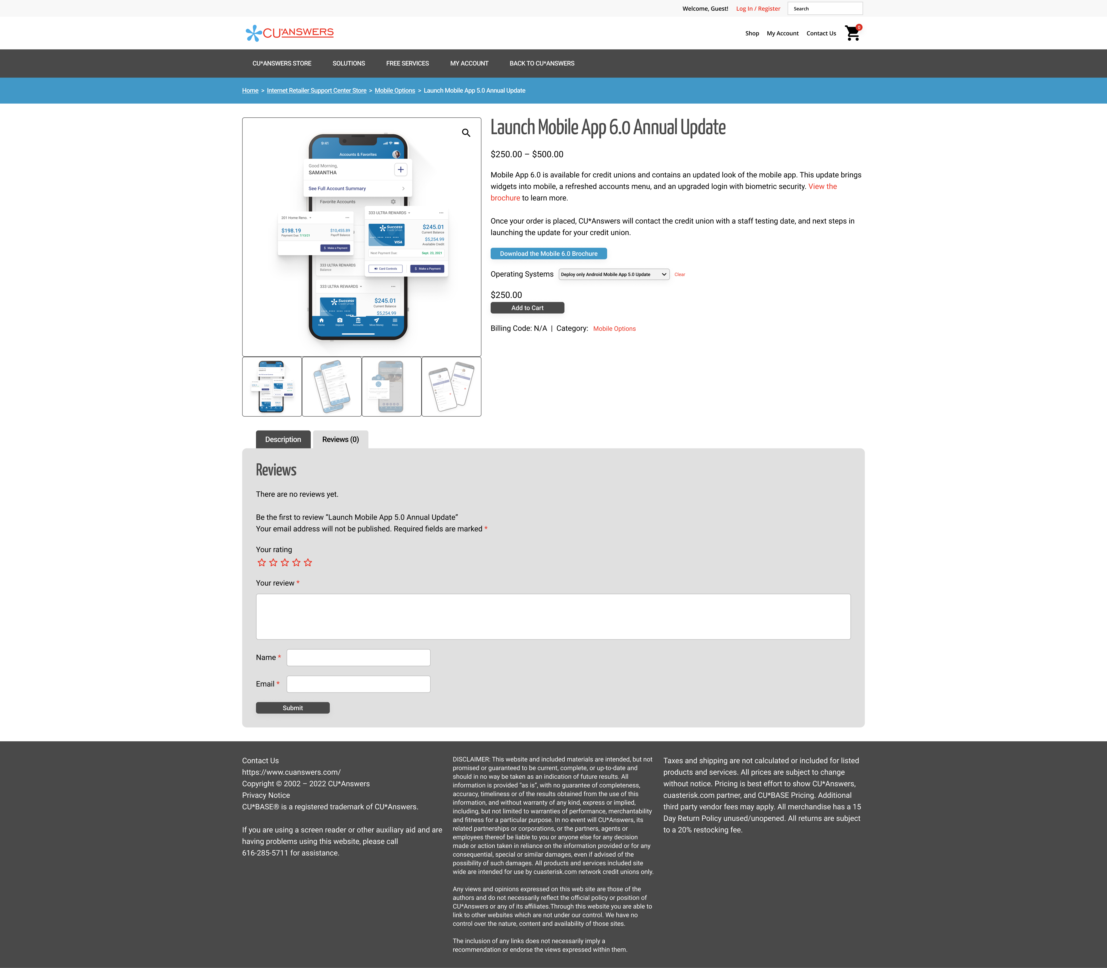
Template sent with new images to show what the vision is for the flagship mobile app update page.
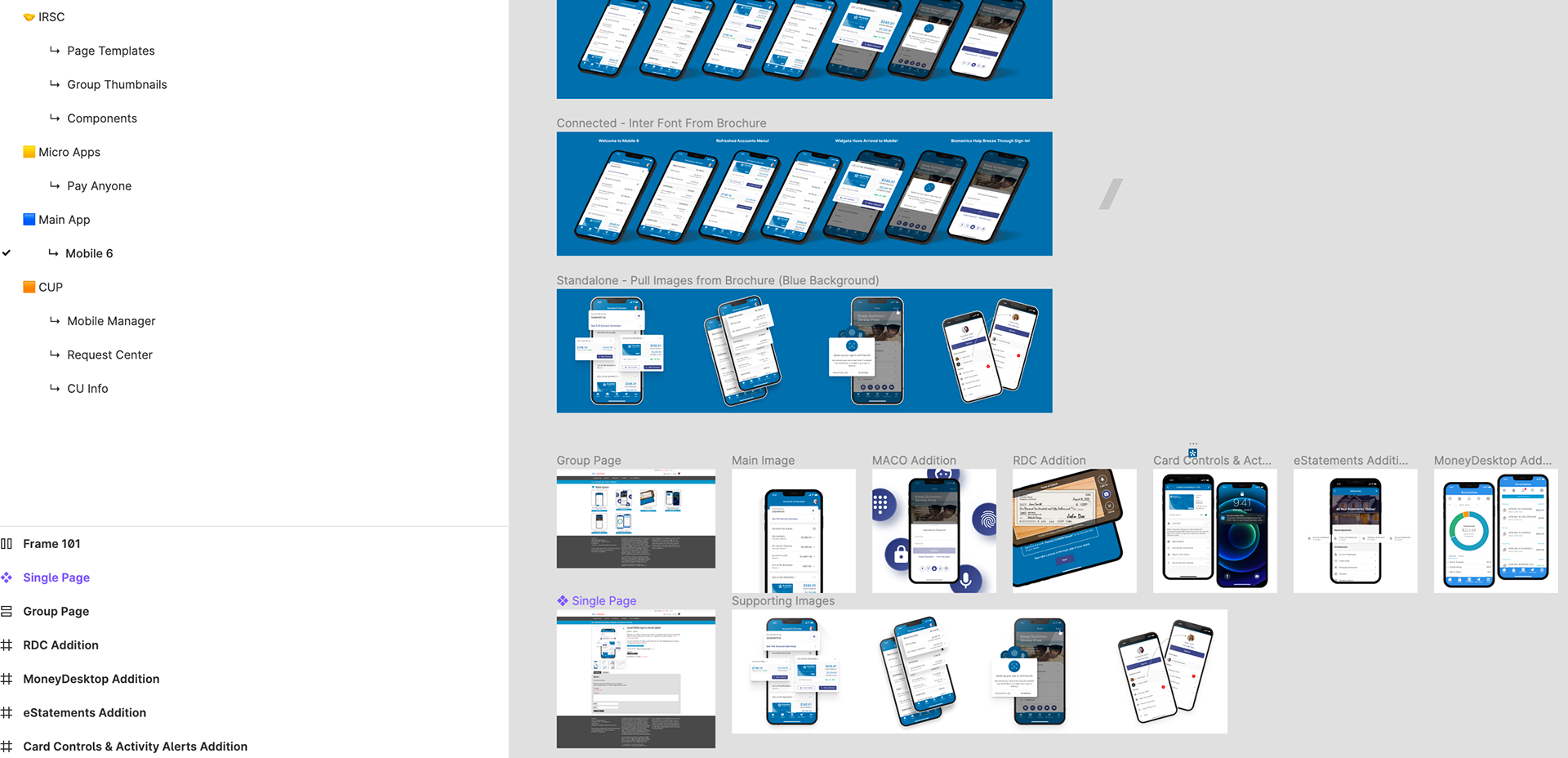
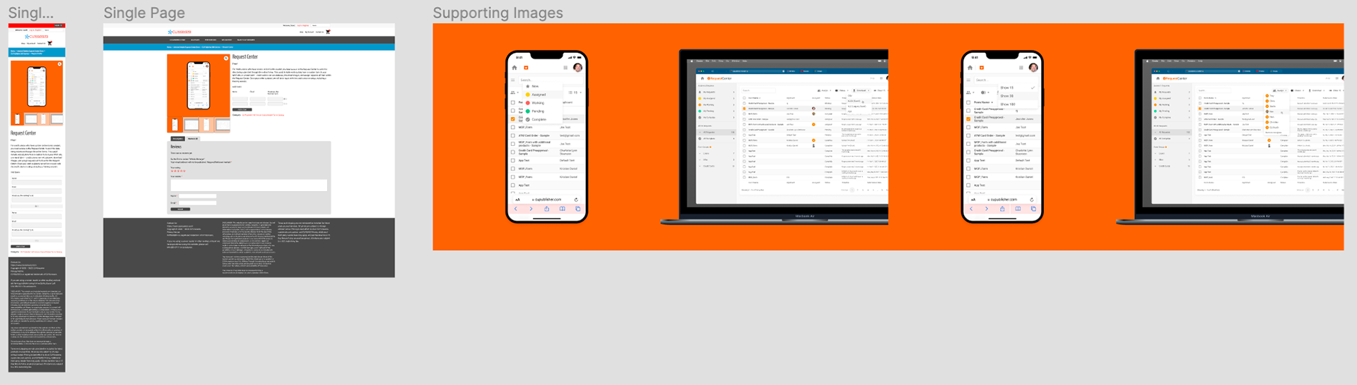
Iterations shown with proposed looks and all working files used for handoff.
What's Next?
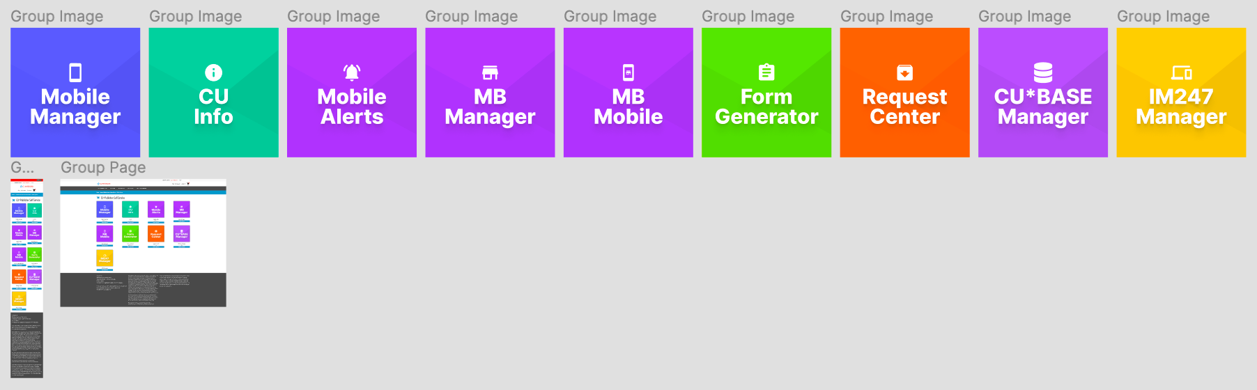
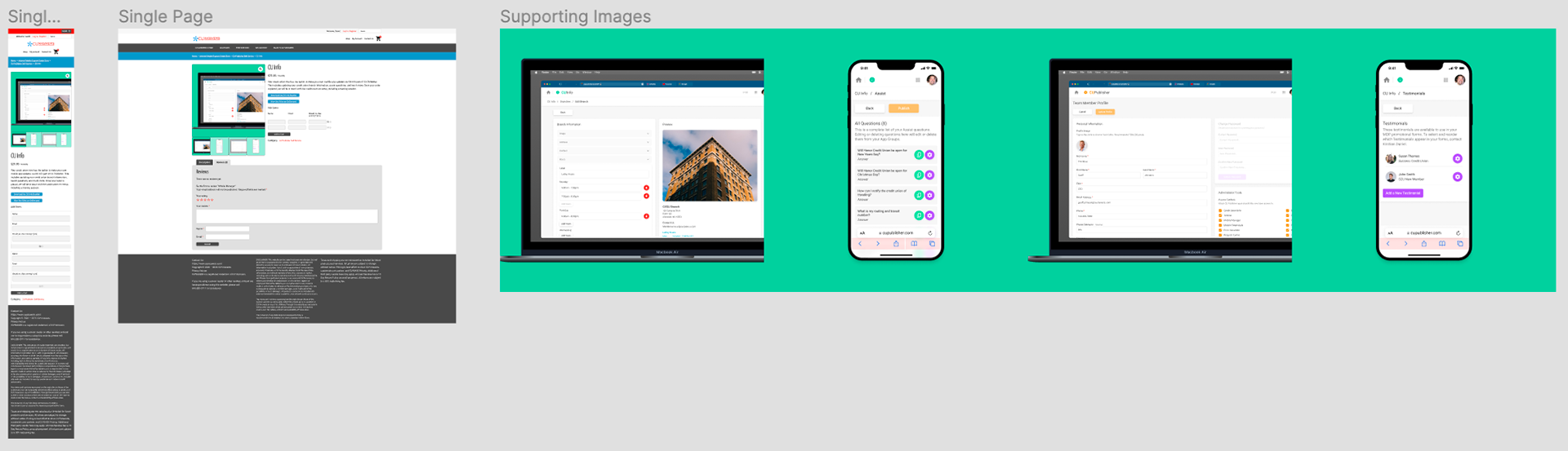
With a success already on the board, I've been duplicating the system on each of the products listed on the store. Some I'm not directly involved with, but I know I can still create consistent header images for those groups. By doing this my hope is it will enhance the cohesive nature to the store that wasn't there before.
In the Pipeline: