Problem & Idea
While I was working at Perrin I was interacting with the recipe book quite often. I mentioned that it could use an upgrade and management (knowing my design background) let me redesign to book for a better experience.
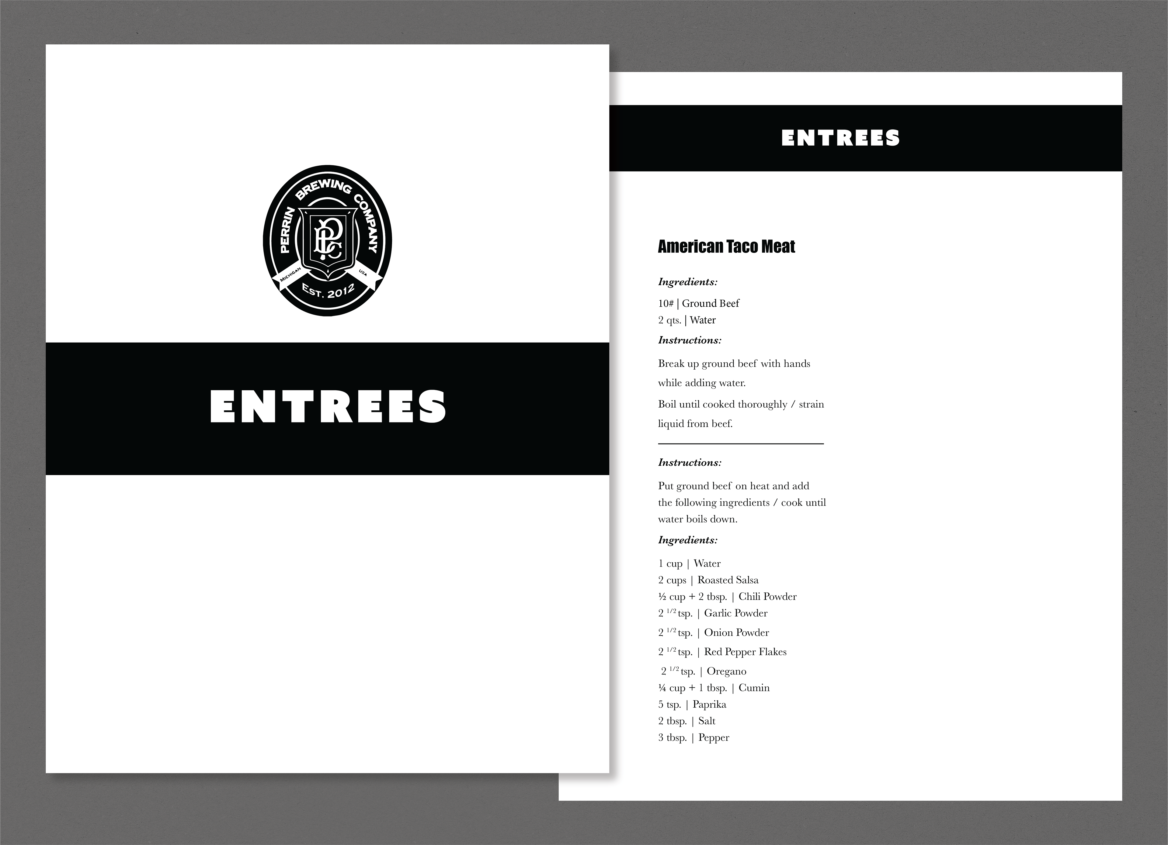
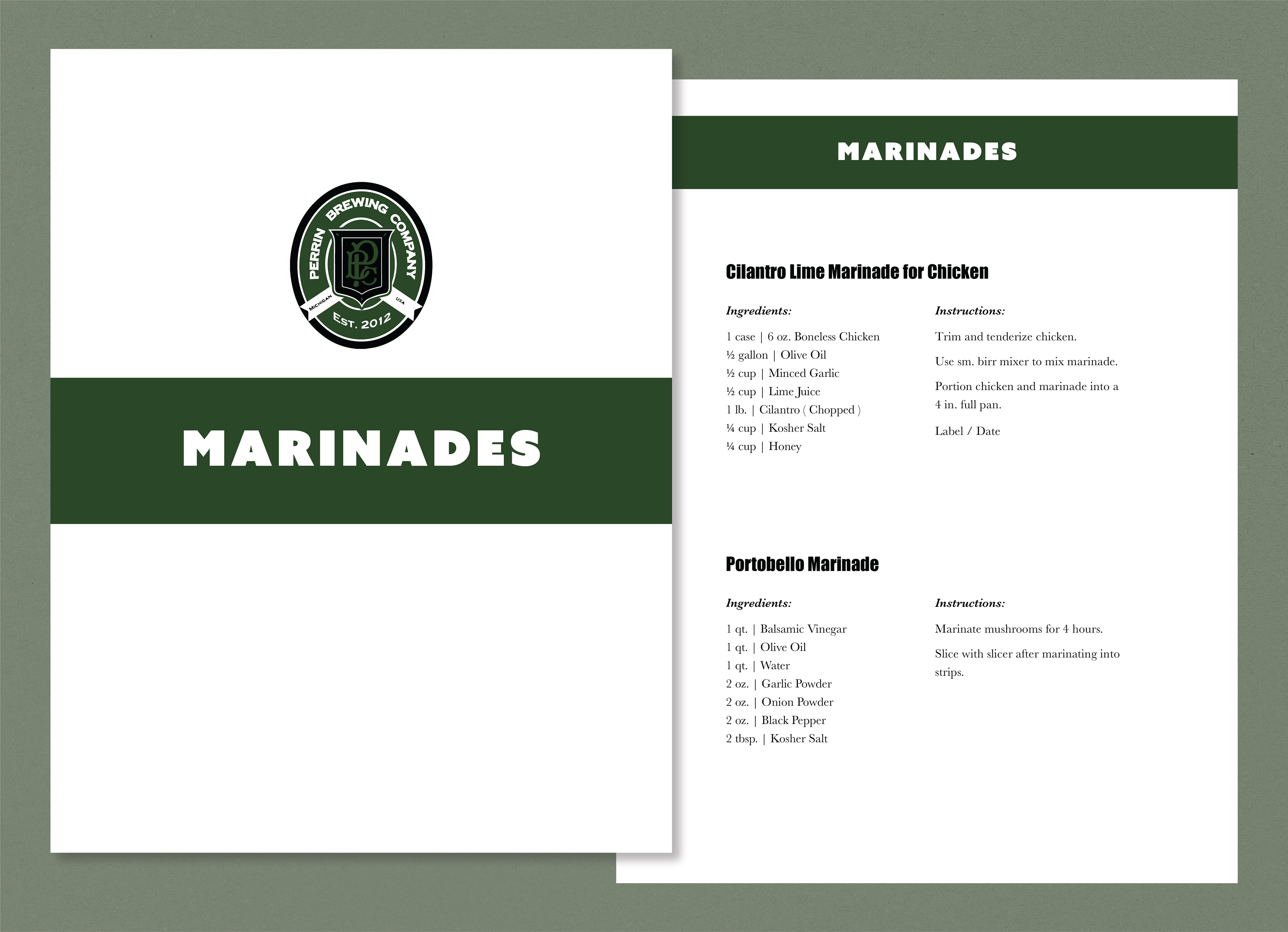
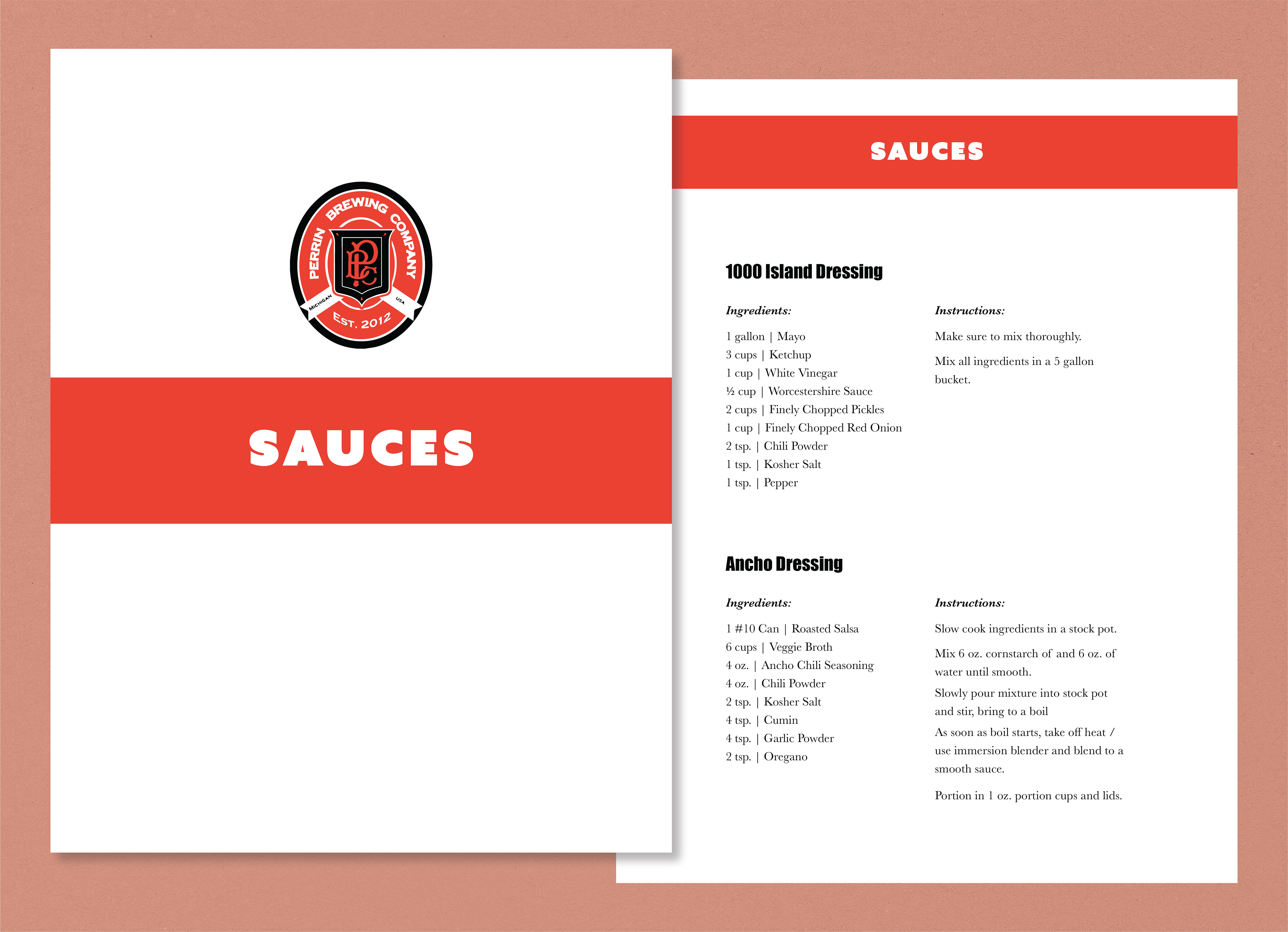
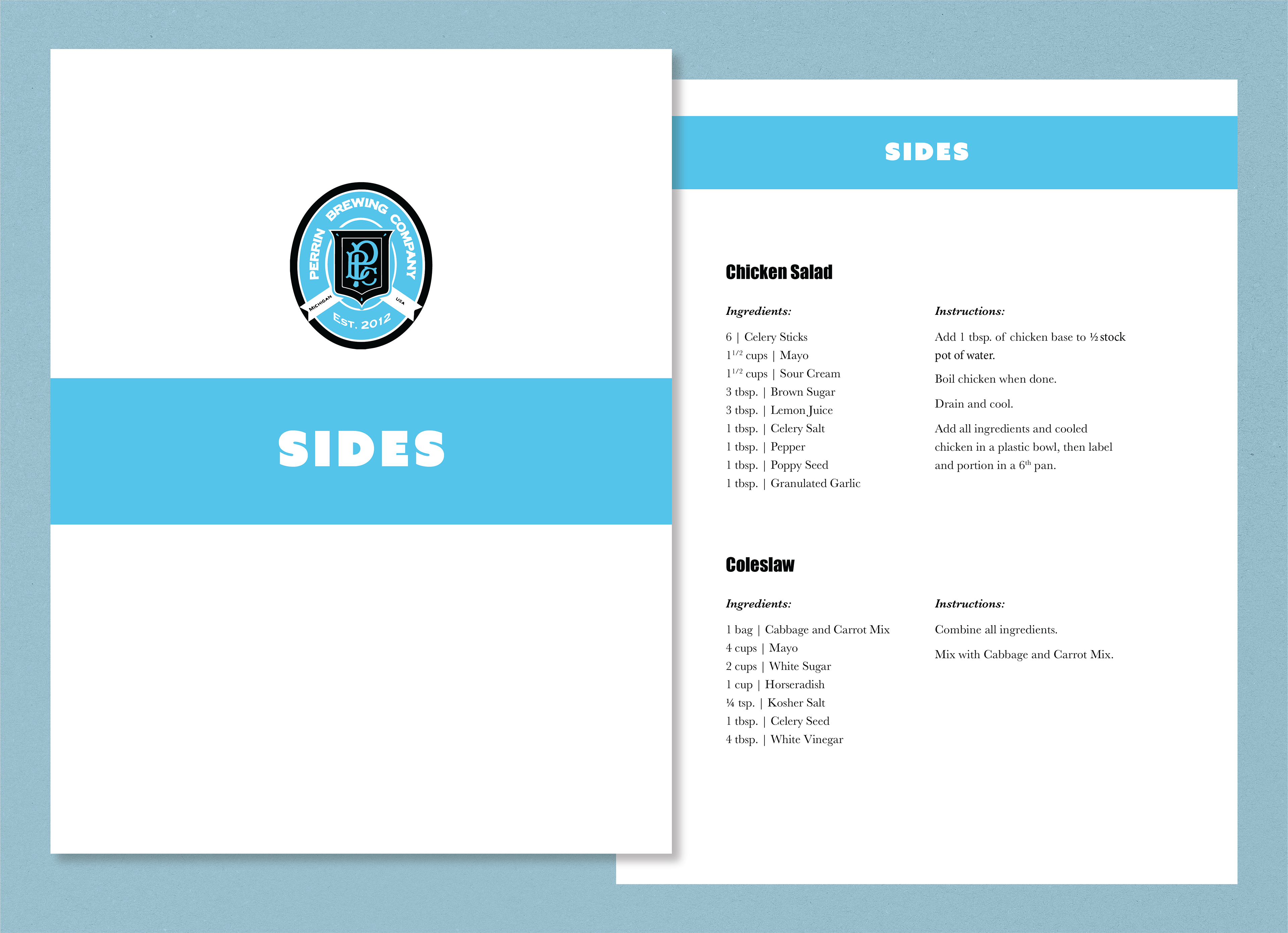
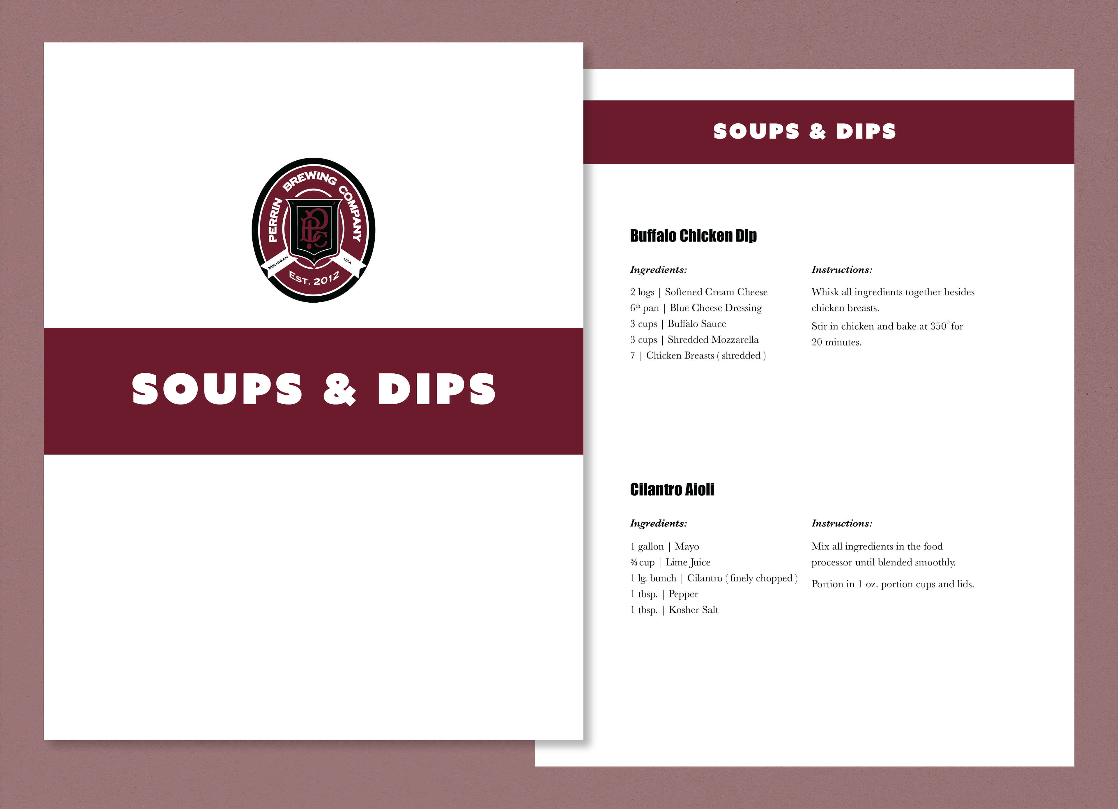
The previous recipe book did not have any headings or any sort of organization to make it easy to find the recipe you wanted to make. For this revamp, I used the various colors used by the brewery in their can branding and used them for the different categories in the book. Using these bright and bold colors, it becomes simple to find the category and then the corresponding recipe you are looking for.
These are real pages from the book, but do not represent content in its entirety. I wanted to show just a singular example of each recipe page.
The recipes were also put in alphabetical order for finding ease. There is a distinct typographic hierarchy between three separate elements involved in the recipe: the title, the heading, and the description text. In the previous recipe book there was no distinction between ( instruction ) and ( ingredients ), so I changed that by making an italicized heading with space around it.
